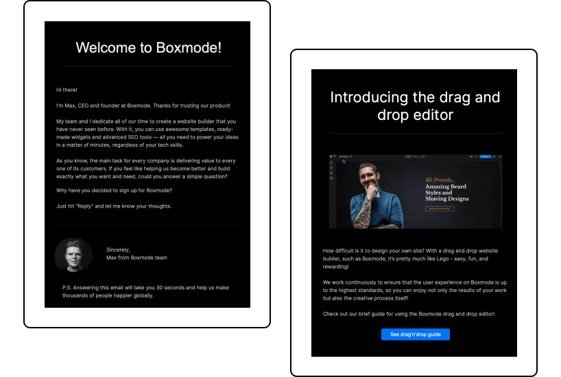
With an estimated 319.6 million emails sent and received daily worldwide in 2021, it makes sense to reach your customers using this form of communication. The same report indicates that online email campaigns have a higher click-through rate than social media. And a 2020 survey showed that 74% of the United States’ B2C marketers used email newsletters as part of their marketing strategy.
One of the first steps to building your online presence is creating your business website. You have to lead your email readers somewhere to convert them into your customers, right? But, once you’ve done this, you need to turn your attention to promoting your brand.
Many website-building platforms enable you to integrate popular email services into your website. For instance, the Boxmode website builder allows you to connect a Mailchimp account to your site and receive data about the email campaigns through their service.
Email marketing with content-based newsletters is one of the most effective ways of selling your brand’s products or services. However, creating a winning newsletter that makes your customer click on and read it may not be that simple. This is why we decided to make this guide on email newsletter best practice tips and advice.
Read on to discover how to turn your email newsletter from humdrum to remarkable with our winning newsletter best practices for small businesses.
Email Newsletter: Subject Line Tips
You might have an impressive subscriber’s sign-up list, but if you don’t keep attracting their attention, you could end up with many unsubscribers to your emails. To avoid this, think for a moment what the first thing that catches your attention when you see an email in your inbox is. The subject line, of course!
Here are some subject line tips to keep your audience engaged and willing to click on your newsletter as soon as they see it.
1) Avoid spam words
Make sure your email gets delivered by avoiding spam-trigger words such as “buy,” “check,” “save,” “stop,” “free,” and others in your subject line. Too much usage of these words often means your newsletter ends up in SPAM mail.
Another tip for ensuring your email gets delivered straight to your customer’s inbox is to avoid using all caps and going overboard with punctuation marks. They reek of SPAM!
2) Get personal
Your subject lines should reflect the topics that matter to your audience, enticing your readers to open and find out more in the newsletter. Personalize your subject line by talking directly to your audience’s needs.
For example, the segmentation of your audience can help you achieve better results. You can group your audience by demographics, behavior, level of engagement, industry, etc.
Suppose you want to target education business owners. Compare these two subject lines and decide for yourself which one you would open first as an educational business owner wanting to build a website:
- Boxmode Website Builder
- Grow Your Education Business With Boxmode Website Builder
The second subject line gives a product description while targeting the right audience.
3) Make it Active
A subject line that includes verbs tells a reader what action will occur when they read the newsletter. If you’re familiar with the call-to-action technique on websites, you know how powerful they can be. The same technique you can use to inspire your reader to open the email knowing there will be some action ahead.

The subject line, “Take Your Brand Online with Boxmode Website Builder,” clearly entices your audience to learn more about building their online presence.
4) Keep it short and concise
Too often, a subject line includes too many words that make little sense. Shorter email subject lines are more eye-catching, resulting in more click-through rates, and they display well on smaller screens. Keep in mind that only the first 35–40 characters of the subject line are visible on mobile devices. On the desktop, it’s usually 70–150 characters, depending on the screen width.
Inserting one emoji in a subject line is a good idea, if appropriate, and matches your brand’s voice and tone.
It also works well to ask a question in the subject line.
Examples:
How much does…?
Is your business…?
Are you tired of…?
However, you should avoid asking questions that are too general. Knowing exactly what questions your audience wants to know answers to is essential for a successful email campaign.
Remember to stay concise. The readers need to know immediately what the newsletter is about. If it’s not clear right away, they probably will not open the email.
Newsletter Design: Best Practices
Any email newsletter guide will tell you to take advantage of the creative use of design. Email marketers will tell you that the most read emails are those that take advantage of newsletter design best practices. Let’s discuss some of them.
A common thread. Keep your copy concise. This way, you’re not wasting your subscriber’s time by wading through loads of text. Tell them what they need to know and make them want to link to your website for more content.
Responsiveness. The statistics show that people open almost 62% of emails sent worldwide via mobile phones. The number of desktop openings is significantly smaller, around 10%. That’s why making your email design responsive is a necessity.
Layout design. Your newsletter email layout design depends on many factors, like its purpose and content. And one of the best ways to create successful newsletters is to create a few email newsletter designs and customize them for your needs by simply mixing column and text sizes.
Here is how we adapt layout design based on an email’s topic and goal:

Branding. Adding your company’s name and logo or other brand identifiers to your email newsletter is a good practice. By including such information, you can make your emails recognizable and reinforce your branding.
Placement of CTA. Locate the CTA in a prominent place, making it easy to see. Use sharper colors that make the CTA stand out. If it’s a button, keep CTAs texts as short as possible, preferably no more than four words. This makes the buttons very specific and looks nice in design. Ensure the URL works correctly if you style a CTA as a simple link or an image (which is less recommended).
Although it’s better to have one CTA per email, if you have a few, make sure there is the dominant one that can’t be missed.
Here’s what Viacheslav Strohyi, Boxmode’s marketing team lead, has to say about creating a good CTA.
“When creating a winning newsletter, you need to logically compose the content so that your readers understand what they need to do, why, and what benefits they will get. The CTA should be the final push to the target action and show your reader the path to your site or product. Make sure this is the shortest path without any unnecessary steps that may distract the reader from the target action.
Suppose you nevertheless want to use several CTAs in one email. In this case, it is crucial to set up the tracking for links using UTM tags (namely, the utm_term or utm_content parameters) and write unique CTA identifiers. This will help you understand which CTA works better and adjust your email’s content, if needed.”
Viacheslav Strohyi, Marketing Team Lead at Boxmode
Minimal clutter. Take advantage of white space (area between design elements) in your email. This way, your newsletter design looks less cluttered and easier to read. Plus, your newsletter will look better on mobile devices, too.
Email footer. This small but essential detail often slips our attention. There are many ways to end your email gracefully with nice words and contact information, such as your company’s address or social channels. But what you need to definitely do here is to offer the recipient a way to unsubscribe. This is not only a best practice but often also a legal requirement. For example, the U.S. and Canada legally require you to provide your subscribers a way to opt out.
Effective newsletter designs also balance both image and text content for a more visual appeal.
Best Practices: To Engage Customers
While subject lines and newsletter design are essential for engaging your customers, there are other tips you need to know for better click-through rates and audience engagement. A key point to note is that less is more, so try to minimize graphics while still engaging your subscriber to take action.
Balance information and promotions by engaging your customers with useful, educational content. Your subscribers signed up knowing your products or services, but they don’t want to be bombarded with constant promotions.
Engage customers by telling them exactly what they’re signing up for. The newsletter sign-up best practices advise you to inform your audience about how often you’ll be sending newsletters, what content to expect, and when.
Take advantage of the preview pane and capture your customers’ attention by including the key message of your newsletter in this section. A table of contents is also helpful for letting your customer engage with content most valuable to them. This also enables recipients to scan and read what’s important for them, making your newsletter a convenient source of information.
Newsletter Frequency Advice
Consistency is the key to a successful email marketing campaign. Your customers like to receive newsletters that arrive in their inboxes on the same day and at the same time consistently. This means if you’re sending a weekly email, make sure it goes out on the same day every week, landing in your customer’s inbox at a standard time.

However, avoid being overzealous with the number of emails you send out. Too many could result in unsubscribes. Unfortunately, there’s no magical solution to getting the right balance. But, use your A/B testing log to gauge what gives you the most open and click-through rates. Using this function, you can test the frequency of sending out emails that result in fewer unsubscribes.
Sticking to a consistent pattern when sending emails also shows you’re professional in your small business marketing strategy. As a result, your readers may respond better to a dependable company that values its customers’ time.
Best Ecommerce Newsletter Practices
A recent study showed that up to 68% of Baby Boomers, Generation X, Millennials, and Generation Z customers say they prefer getting promotional emails from their favorite brands. This is why newsletters are vital for growing your ecommerce business.
Key factors for a winning ecommerce newsletter include some of the following:
- Adding internal links that drive your customers to click through to a high-converting landing page.
- Having a clear, loud, and bold CTA in your newsletter.
- Offering discounts, coupons, and free products or services.
- Using subject lines to show what you’re selling.
- Providing captivating and valuable content.
- Taking advantage of clean lines, glossy images, and white space.
- Optimizing newsletters for mobile devices.
- Running A/B testing regularly to check what is and isn’t working on your emails.
Follow these best ecommerce newsletter practices and rest assured your email campaign is a winner every time.
Create Your Killer Email Newsletter Today!
By using our email newsletter tips, your small business will benefit from this form of communication. Make sure you become part of the statistics showing that email marketing is significant and still growing for both small and large businesses.
Do this by following the best practices for designing a winning newsletter for your customers to enjoy every time they see your email land in their inbox.

