
You’ve spent a lot of time (and sometimes money) setting up your website. There are many ways to get your online presence noticed. And, you must ensure your website does get noticed, and it’s not floating “out there” with no buy-in potential at all.
Let’s assume your website is getting the traffic you want, and users are noticing what you have to say. But have you thought about how you’re going to turn that attention into action?
Converting your audience’s interest from what you have to say to buying requires convincing them to take action. Otherwise, you’re not going to make the sales you want.
And, this doesn’t only apply to selling your products or services online. You may want your readers to continue reading on your site. What can you do to persuade them to stay with you on your website?
How about the email subscribers list you want to grow? Or, sign-ups to your next webinar? All of these require asking your online user to take action. Fortunately, online marketers use psychology basics to guide them in creating the best way to get people to take action. And, it’s known as a call to action.
What Is a Call-to-Action and Why You Need to Know
More commonly referred to as CTA, a call to action is exactly what it says. It’s a prompt asking your online visitor to take a specific step or action. You do this by offering instructions or guidelines such as “Start Free Trial” or “Buy Now.”
The CTA is a popular and most effective digital marketing tool online. It works for selling both products and services. It’s a dynamic way of getting people to sign up as an email subscriber, download an ebook, or even attend an online workshop.
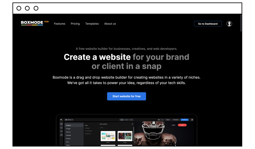
A call to action grabs your online visitors’ attention, encourages them to take a necessary step without making them feel intimidated. At Boxmode, we like to believe our CTA button to “Start website for free” on our landing page is why our conversion rate is so high for website builders.
You can use a couple of words as your CTA, such as “Sign up today” or “Read more.” But you can also create a phrase to persuade your visitor to take action. An example of this would be, “Do you want to find out more about how to transform yourself? Subscribe now to get our monthly newsletters.”
So, if you’re serious about creating an online marketing campaign that gets you noticed, ramps up your sales, and grows you as a business, then you need to know all about appealing CTAs.
Why CTAs Are Important to Online Marketers and Your Business
There are CTAs, and then there CTAs. In other words, you can use any call to action and hope for the best. Or, you can put the effort in and make sure you create a strong action call that’ll make your potential customer want to act.
So, yes, you know now giving your reader a reason to act is important to marketing for your online business. But, if it’s half-heartedly done, then you’re wasting your time. Successful online marketers know the selling power of a robust and enticing call to action. And, they make sure each one they create is above and beyond the mediocre.
Think about your CTA’s purpose. It’s to persuade your online visitor to do more, to take the necessary step to move forward. A well-crafted CTA taps into the visitors minds and tells them two vital things:
- What they need to do (the what)
- Motivates them to act (the why)
By understanding the psychology of sales, online marketers use certain verbs to initiate an immediate reaction and response from the reader. Think of words such as “Click here now,” “Read now,” or “Join today” and imagine the kind of response they prompt.
Most times, a person feels driven to do exactly what the CTA directs them to do. And, when it looks so simple, clicking on that little blue button seems the easiest step to take. That’s the power of a well-crafted action call.
The goal of a strong call to action is to direct your online visitor on the buyer’s path. The successful outcome would be a sale, a sign-up to your email database, or even registration to one of your online courses.
A clickable button is one of the most effective and widely used tools found in any online marketer’s toolbox. Ensure you know how and when to use it so you get the most out of it.
How and When to Use a Call-to-Action Button
We’ve already touched on the importance of using a strong CTA. But, what exactly do we mean by this? Remember, content helps to build up emotion. You want to get attention, create interest, develop a connection, and give a solution. The action buttons or words simply respond to all of this build-up and give the visitor the “what” and “why” for taking action.
Your call-to-action button can be seen as the bridge or the connection that moves your online visitors from the information they’re interested in to something of higher value.
CTAs are typically a button, an image, or a link that takes your readers to the next part of their journey on your website. Call-to-action buttons, though, have proven to be one of the most effective ways for the most conversions on your page. It looks simple and is easy to use; all you have to do is click and follow the lead.
Here are some tips on how and when to use your CTA button to get the conversions you need to grow your business.
- Make sure you use the right words and phrases. This is a crucial component of developing your action prompts, so we’ve written a whole section about this below.
- Don’t go overboard with the number of buttons per page: If you use too many buttons on one page, you’re likely to lose your visitors’ attention by giving them too many options. This leads to feeling overwhelmed, and your potential customers may decide to leave the page rather than respond to your numerous action calls. Balance out the number of buttons on one page so it still engages your audience and triggers their “I must take action” response.
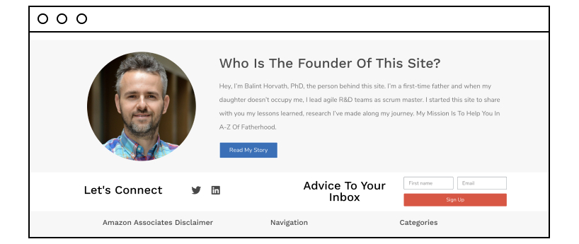
- Keep it simple. If you ask your readers to do too many things in one step, they may feel threatened or intimidated. Your button must be a simple process that follows through and motivates the readers to stay with you. This is an example from Projectfather.com, a parenting website that gives the option to get more information by simply adding a first name and email address and then clicking on the “Sign Up” button.
- Make your clickable button stand out. And you do this by using a different color button in the page’s background. This is why these buttons are red, blue, green, or whatever color you find them in. Your button must stand out in contrast to other colors on the page.
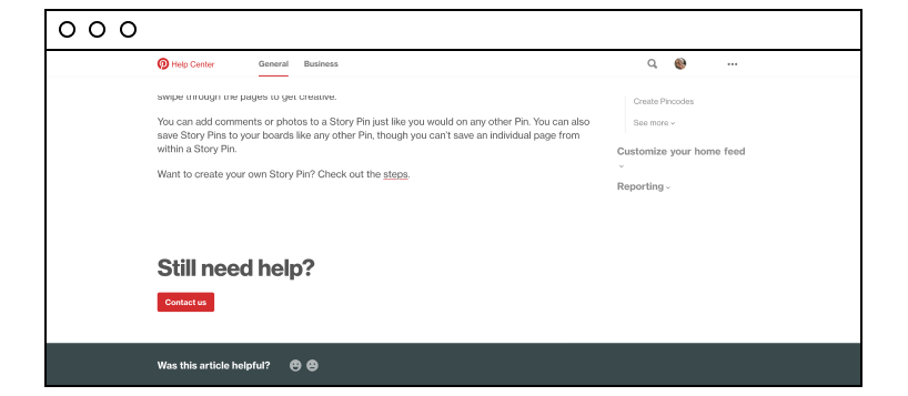
- Don’t get fancy. You may be tempted to change the format of your button shape. But this may not be a good idea. Why? Because the human mind wants to stick to the familiar. If the button is not the conventional box/rectangular shape, potential customers may not respond to it. Would you feel “safe” clicking on the Pinterest call to “Contact Us”? Yes, because it’s in the format you expect. And that makes you comfortable.
- Make it obvious: In other words, keep it big, blue (or whatever makes it stand out), and obvious. You want your online users to know what action they must take, and if they’re searching for your button, then you’ve done it wrong.
- Placement is vital: This is also another way of saying “make it obvious.” Place the button where readers can easily see it and where your online readers expect to find it.
- Make it personal: Personalized call-to-action buttons help your online users decide based on what they personally want from the action they take. This is a move away from the conventional “Sign Up” button to something such as the “Plan Your Holiday Now” button. See the difference? The second button hits the users’ personal need to plan their holidays and prompts them to start the process.
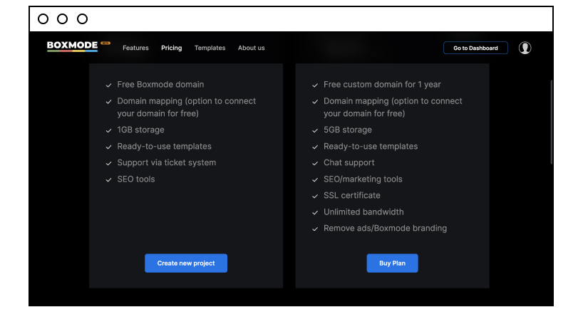
- Descriptive copy is the lead up: The words or content around the button is essential. This is the information that entices your potential customers to act. It builds up their interest and prompts them to want to know more, which is why they’ll click on the button. Check how we do it by giving information about our pricing plans that lead to the blue, clickable button.
Call-to-action buttons are familiar, easy to implement and use, and are able to increase conversions exponentially. While it’s tempting to get innovative, it’s sometimes a good idea to stick with what works.
By following these tips, you will get the most out of a strong CTA button.
What You Need to Know About Call-to-Action Phrases and Words
We already mentioned that CTAs make use of verbs that get your reader motivated to act. Examples of these words would be:
- Learn more
- Join us
- Sign up
- Buy now
- Subscribe
- Try now
- Get started
- Contact us
Once again, online marketers turn to psychology to understand which words are likely to convert a prospect to a customer. These words could be “free,” “new,” “you,” and more. The word “you” is compelling when you’re trying to form a connection and want to personalize an experience.
Even more effective is using words that add an element of urgency to the message, such as “now,” “30 days,” “hurry,” or “last chance.” These are words you need to think about when writing up phrases for your action calls.
Some of the most popular phrases used for a call to action are:
- Start your free trial now
- Try our 30-day challenge now
- Claim your free gift today
- Want to earn more money today?
- Offer expires soon!
- Talk to an expert today
- Get your coupon now
- Get 50% off when you buy today
- 100% free when you sign up today
Make sure you know what words and which phrases will drive more conversions on your page. We listed only some examples of these, but there are more to play with. Find out which have the most popular responses and build your own action messages around them.
13 Call-to-Action Examples to Get You Started
Let’s check out how other companies are maximizing their marketing strategies with call-to-action words and phrases.
We selected brands that have used:
- Highly effective CTAs but have kept it simple at the same time
- A balanced approach to call to action without overwhelming online users
- Phrases to motivate their reader to act – now!
1. Krispy Kreme
Using multiple buttons on one page can get out of hand unless you keep it balanced with strategic placements. Check out how Krispy Kreme has mastered this, using content information to lead to the buttons.
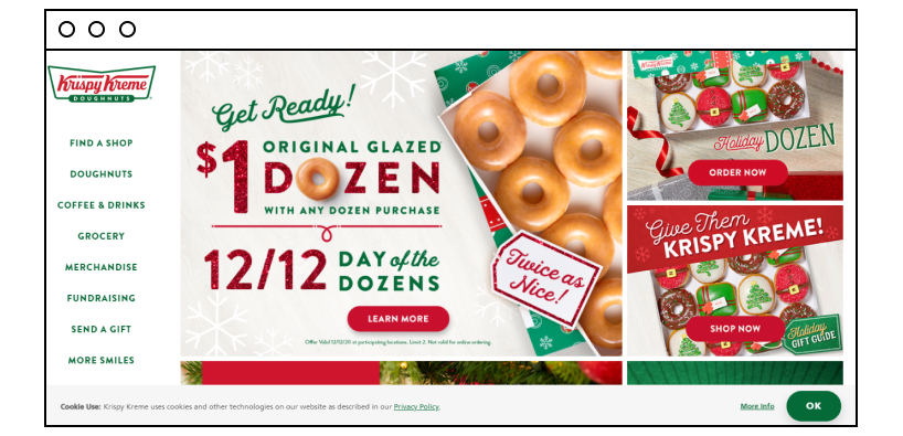
The use of words like “Learn More,” “Order Now,” and “Shop Now” tells the reader immediately what to expect when they take action. They’ll either “learn” about the dozen special or “order” the product or go shopping with the “shop” option.
Plus, the green “OK” button draws your attention to the website’s cookie use policy.
2. Cars.com
This page also uses multiple buttons with simple words such as “Search by make” and “Search by body style.” The verb here is “search,” and it’s also used in a simple green colored box. A “Sign Up” box on the top indicates you can connect further with this company.
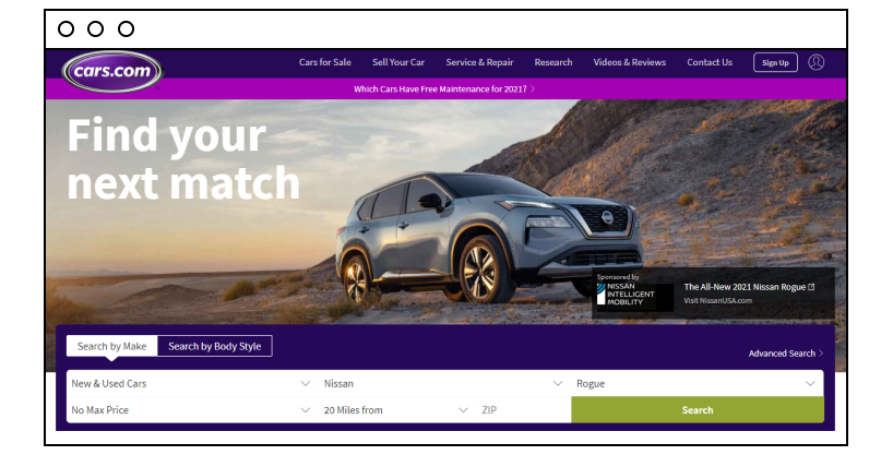
Note the words used in conjunction with the “search” word being “Find your next match.” This copy ties in well with the action call.
3. Boxmode
Another one from us! We also use simple but powerful words to lead you to the action button, “Create Website.” Note how we make a bright and colorful contrast, not with just the blue button but with the copy around it. We’re not shy about demonstrating and using the word “Free” either!
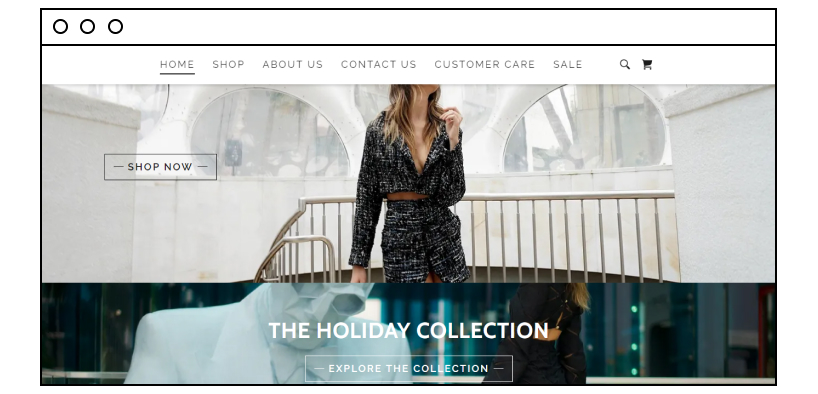
4. Diana Kassbov
This clothing website uses a phrase that invites you to explore its range more. The button stating ‘Explore The Collection” gets your attention and makes you want to do exactly that: go exploring! And, the lead words are “The Holiday Collection,” so you know you’re going to explore the range of clothing in this collection.
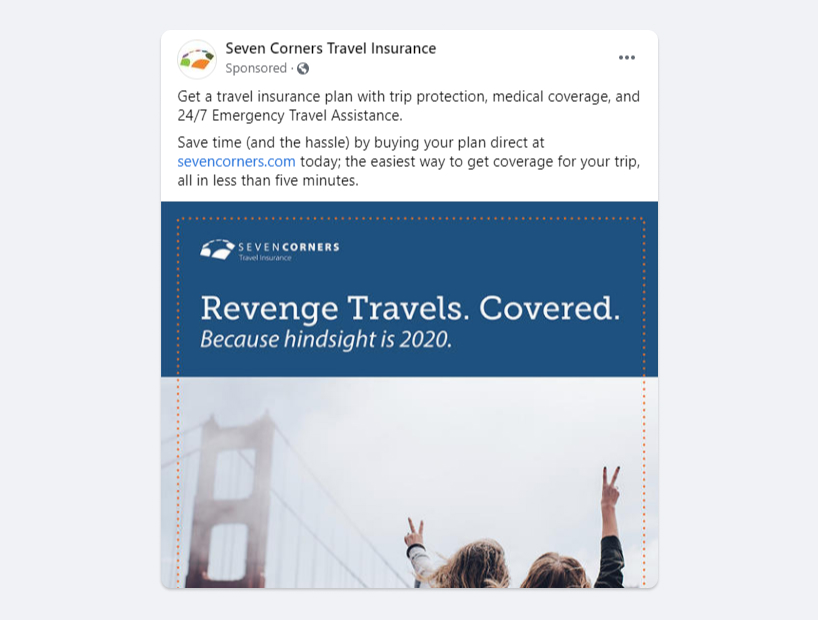
5. Seven Corners Travel Insurance
Facebook is often used for advertising a business. This one from Seven Corners Travel Insurance uses a call-to-action at the top of the ad. Note the words used to direct your attention to its page so you can take further action. Call to action is the link provided to take you to the company’s website to find out more about travel insurance services.
6. Duo Security
Here’s another Facebook ad. This time the company has included a “Download” button.
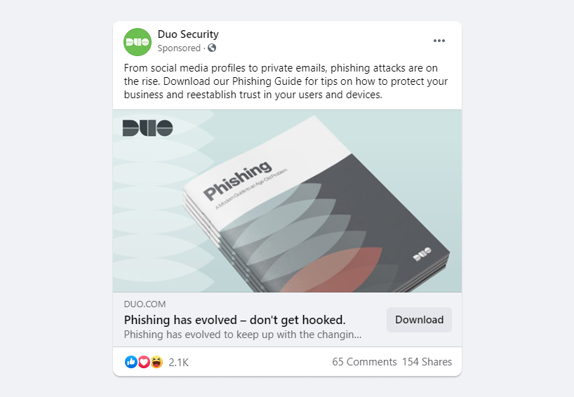
The leading words “Phishing has evolved – don’t get hooked” line up nicely with the button. You have no doubt in your mind what information you will download. The image also highlights the word “phishing” and the ebook you can download.
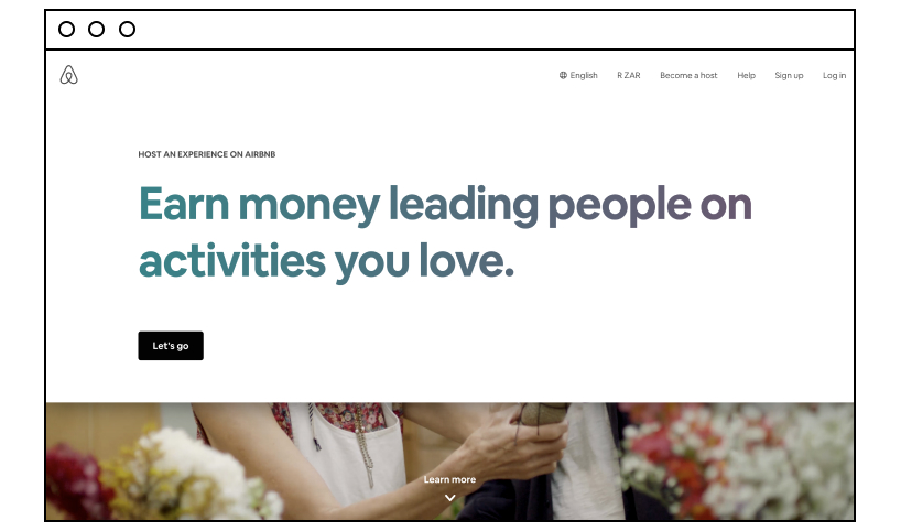
7. AirBnB
This travel community brand uses “Let’s Go” in a simple, black box. It’s relying on the text to grab your attention. After all, who isn’t looking for ways to make extra cash these days? This page has been kept to the bare minimum, leaving no doubt in your mind what you need to know and what you’ll discover when you take action.
Using words such as “let’s” is inclusive and makes the readers feel you’re engaging directly with them and they’re not alone on the journey. It tells you “we’re all in this together.”
8. Spotify
Here’s a company that’s not shy to use bold colors and powerful words such as “free,” “3 months” and “premium” to draw its customer in. Then, the prompting action phrase is highlighted clearly in a black box – “Get 3 months free.” With just four words, they’ve told you what will happen when you act.
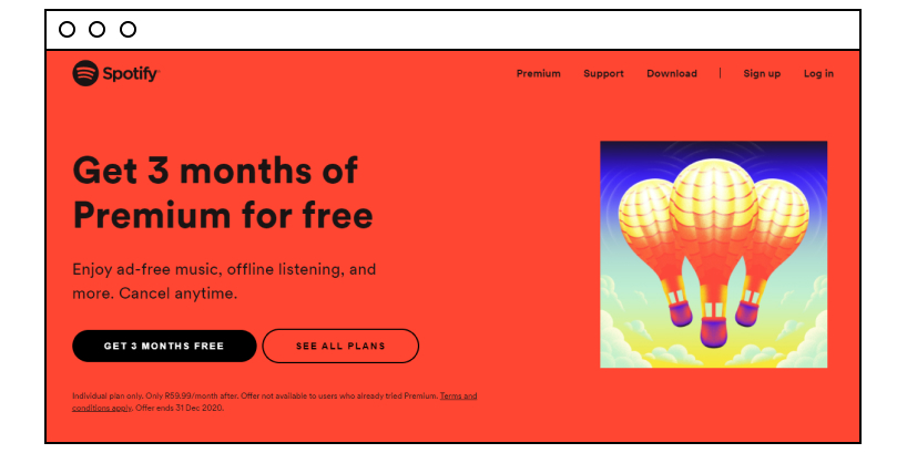
Another button invites you to explore all the plans on offer, “See All Plans.” By using the word “free” often, the brand wants to reassure you that you can try out its Premium plan without paying for three months. This is less threatening than saying, for example, “Buy Now” when enticing customers to commit to a plan.
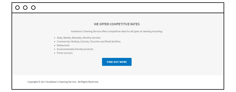
9. Acadiana Cleaning Services
Simple often works the best, and without trying to get fancy, this cleaning service company offers competitive rates for all types of cleaning. The visitor reads down the list, and in their direct path is the “Find Out More” action button. It’s blue, so it stands out against the plain background.
Nothing fancy, but it tells you what you need to do if you want to know more about the services.
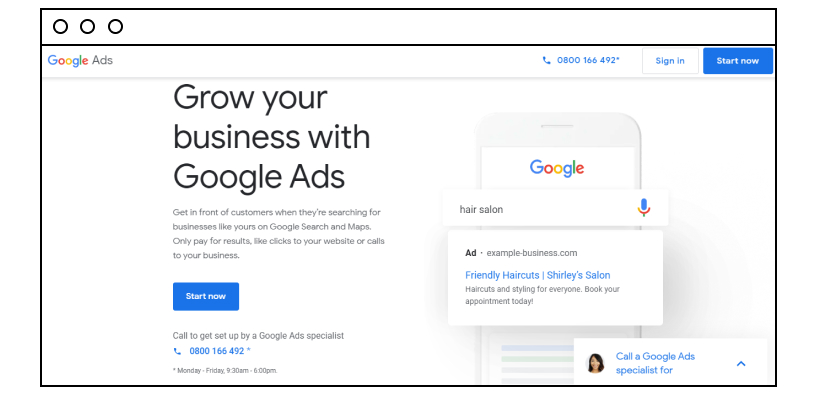
10. Google Ads
The big guys aren’t scared to use simplicity either when getting some action out of their potential customers. If Google can do it, so can you! No beating about the bush here. The text tells you what you can do with its ads (grow your business), how to do it, and then tells you what to do to get started. “Start now” is all you have to do to begin the process.
Simple black and white text is used to lead you to the button. What’s more, the company uses the familiar blue button color often associated with these clickable buttons. And, it contrasts well with the plain background. At a glance, you know where to go, what to do, and why.
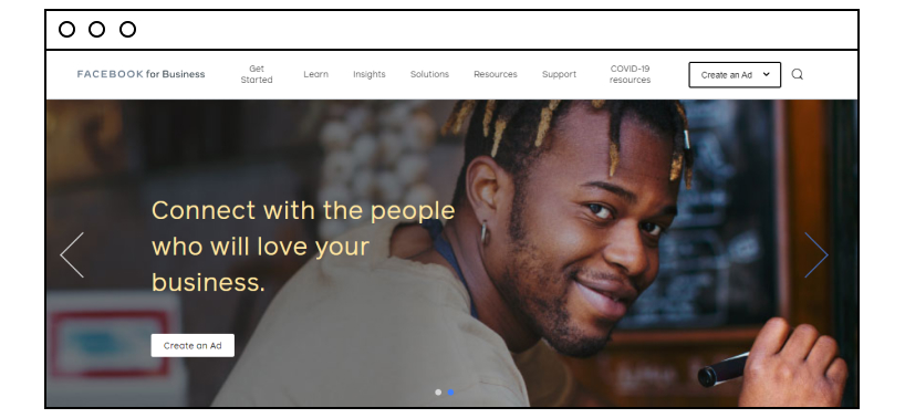
11. Facebook Business
Even Facebook keeps it simple, although it has gone with an image to get those “feel good” emotions going. The text’s font and color stand out well against the background. And it tells you to “connect” with people who will love your business. Two simple boxes are added for you to take action.
Both say the same words, so if you happen to glance at the banner, you’ll be encouraged to take action. But if you’re reading the text, there’s a button stating quite clearly, “Create an Ad.” The active word here is “create.”
12. Mcdonald’s
OK, here’s one from the Ronald family! You’re buying its meals online, and you’re given clear instructions with the buttons. You can “Order McDelivery Now” or “Use the App to Order.” Simple use of words to create a phrase for a call to action. Note the active words it uses (order/use) and some urgency thrown into the mix (now).
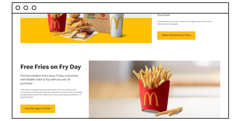
Note the following:
- Clear instructions
- Detailed information leading up to the buttons
- Great color contrast
- Placement of the buttons
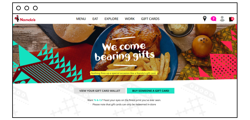
13. Nandos
Spot the phrase with this fiery chicken brand. And, then check out the words used to get the reader to act. We’ll leave this one in your hands to explore further. But if you still need some direction, note the following:
- The simple direction copy (lead up words to the buttons).
- The phrases used on the buttons (they explicitly describe what will happen when the visitor clicks on them).
A Final Word on CTA
The call to action can make or break your business’s marketing campaign. Marketing gurus will tell you that this is one of the most effective ways of increasing your sales, but only if you do it strategically. That is, you need to think about the words you use and what phrases will catch your reader’s attention.
Placement, color contrast, box shape, and lead up text all make a huge difference to whether your action call works or not. You’re not limited to the button approach, though. You can add an engaging CTA to your headline or description copy. Directing your customer with a link is another effective technique when prompting action.
The takeaway here is you must include CTAs in your marketing campaign and use them correctly if you want to see your business grow. There’s no reason why you shouldn’t take advantage of this one digital marketing tool online marketers love to use.