Without any doubt, a company website is an anchor of online presence and an ultimate harbor of brand identity. However, should you stuff it with every possible content piece your brand produces? For example, you decide to craft highly targeted content to zoom in on a specific part of your audience. Or you’d like to test another, less official way to engage with your target people. Or there’s a new limited offer to tell about.
Instead of bloating your official website with time-sensitive content and harming your relevance, you can launch a microsite for this purpose. In this post, we will explain what a microsite is (and how it differs from a landing page) and give you some microsite inspiration in the form of the eight jaw-dropping microsite ideas.
What Is a Microsite?
Microsite definition
A microsite is an additional, smaller website that represents the same brand as the official company website but usually uses its own independent URL. (Sometimes it can be a subdomain.)
Unlike a traditional website, which provides all-around information concerning a business, a brand microsite focuses on a single aspect of a business or a time-limited campaign. A microsite is perfect for announcing a new product launch, an upcoming event (event microsite), or building brand awareness through more entertaining content (interactive microsite).
Microsites are built around their own branded content, keywords, email addresses, special media, and themes. The main benefit of microsite marketing is that it won’t cost you an arm and a leg. Basically, a free website builder such as Boxmode is all you will need for a one- or two-page microsite.
What a Microsite Is Not
A microsite is often mistaken for a small website, a landing page, or a subdomain, but it’s none of those. Unlike a landing page, a microsite isn’t aimed at lead generation. Unlike a small website, a microsite is never the official website but always additional. And unlike a subdomain, a microsite isn’t attached to the parent website URL (as usual).
Benefits of a Microsite
If you’ve never used microsites for your digital marketing before, you may be interested in how exactly they can add value to your existing website.
More targeted, clearer content
Built around a single campaign, a microsite lets you entirely focus your design and copy on this new product/service/event helping you better target your highly specific audience. This boosts user experience and helps your new campaign stand out rather than get buried under heaps of unrelated content of your main website.
Keeping your homepage from getting cluttered
A homepage featuring too many details, offers, events, and educational content feels confusing and overwhelming. It drags user experience down. That’s definitely not what your brand is looking for. Organizing your time-sensitive content into separate microsites helps keep your homepage tidier and lets its evergreen content shine.
SEO benefits
Since a microsite focuses on a single topic, search engines define its content as more relevant. Also, due to this highly targeted content, you will enjoy a remarkably low bounce rate. In addition, a microsite has its own domain. A memorable URL gives your users easier access to your microsite through an organic search. Coupled with keyword-rich content, it boosts your rankings considerably. And finally, by using a microsite, you don’t harm your homepage’s SEO with irrelevant material.
Affordable solution for short campaigns
Stuffing your homepage with time-sensitive content is unwise, but building full-fledged websites for temporary gigs is even more insane in terms of money and effort. If you go with a microsite, you can put it up using a free website builder. Just fill with the relevant content (Boxmode will take care of the design part), enjoy, and then remove it in a few clicks after the offer expires.
The best place to interact and engage
Сustomers are becoming pickier when giving their attention to brands (thanks to apps, games, and mobile browsing promoting shorter attention spans). So businesses that don’t try newer, more engaging media (such as videos, quizzes, surveys, etc.) exit “the game.”
A microsite is one of the best (and the least cumbersome) ways to experiment with your approaches to the target audience and test different creative interactions. This will not only draw traffic but also create a fantastic user experience. Below we will share microsite best practices to help you see how businesses leverage microsites to amplify UX.
Microsite or landing page
If you’ve ever had experience using landing pages for your digital marketing, you may mistakenly assume that microsites are similar. At first glance, a landing page and a microsite have lots in common. They both are just for a campaign, and they both are smaller than a website and temporary. However, their differences prove they are absolutely unique marketing strategies.
- Size. A landing page is always one page, while a microsite can contain more than one page.
- URL. A landing page is on the parent site, while a microsite can (and usually does) have its own unique domain.
- Purpose. A landing page is for conversion, while the microsite strategy is rather to inform and entertain. Can you use a microsite for conversion? It’s up to you. Does it work? A landing page works better.
A microsite is a perfect choice for growing brand awareness or testing new approaches in communicating with your target audience or its specific part.
8 best microsite examples for your inspiration
We are going to share some cool microsite designs to help you see how brands extend interaction through microsites.
1. “How much is a limb worth?” by ProPublica
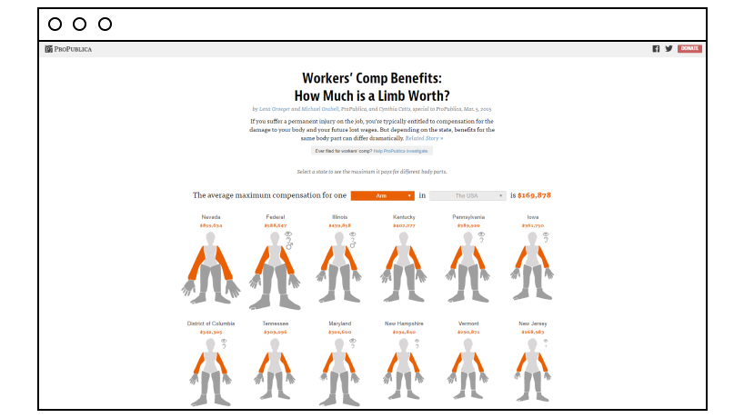
With a truly provocative name by ProPublica, a nonprofit newsroom, this microsite works as a calculator that helps visitors find out how much compensation they would get for injuring a certain part of a body, depending on state legislation or insurance company policies. The idea was to show that none of the compensation benefits can cover the actual damage to a body and lost wages.
2. Every Last Drop by Waterwise
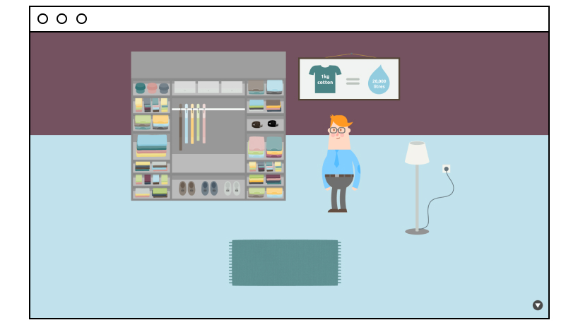
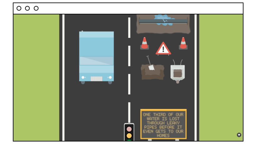
This one-page interactive microsite in the infographic style not only entertains but also educates users on water waste. As you scroll the page down and watch an animated character getting ready for the day, you see interesting stats on water consumption, which goes beyond just using a tap. For example, a cup of coffee costs our planet 130 liters of water. At the bottom, there’s a call to action to watch a video and learn how you can save water.
3. CommUtah by Adventure Cycling Association
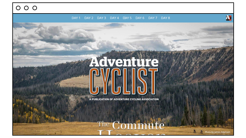
This microsite tells the story of a breathtaking and unprecedented eight-day 421-mile bike ride from Salt Lake City to Moab taken by three cycling enthusiasts. One of them, Kurt Gensheimer (a.k.a. The Angry SingleSpeeder), wrote the copy, which, along with fantastic photos, creates a truly enticing, “being there” user experience. The microsite’s navigation menu at the top enables you to check the journey daily and features media buttons in the footer for sharing.
4. My Creative Type by Adobe
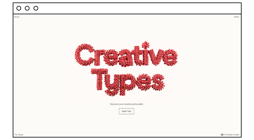
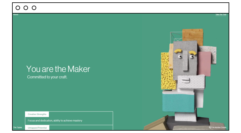
With this interactive microsite, Adobe not only proved its own creativity and authority in its niche but also popped up just where it should be – helping creative personalities know their talents better. The test has simple but sagacious questions and illustrative animations between them to help users find out their creative personalities and share the results using media buttons.
5. NASA Spacecrafts by NASA
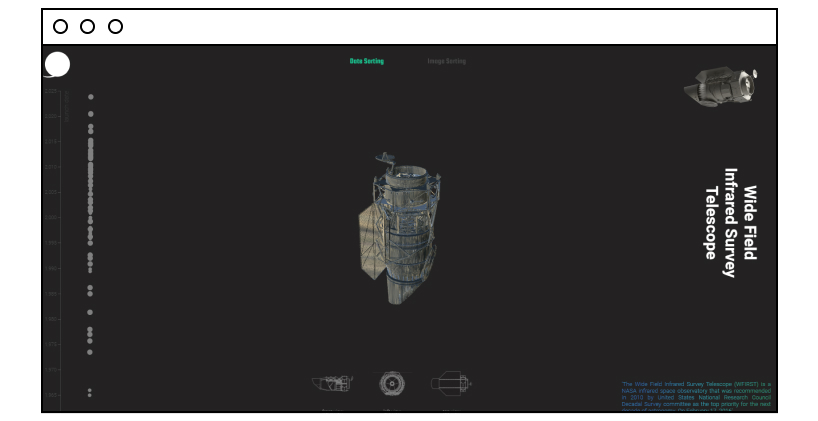
It was logical for a governmental body like NASA, with such a prominent track record, to create a virtual hall of fame to celebrate its steps in conquering space and amuse their geek fans. The microsite enables users to browse NASA spacecrafts and satellites either by date or by image, rotate them using the 3D feature, and see a short piece of information about them.
6. Inside Chanel by Chanel

The microsite (on the parent site domain) devoted to the evolution of the Chanel brand is a place where history and new technologies meet. It contains a huge archive of videos that stylishly combine 20th-century footage and modern graphics. Along with timeline stories, they help track down Gabrielle (Coco) Chanel’s impact on the world’s fashion and modern culture. The microsite looks and feels expensive and apparently even smells like Chanel No.
7. ElfYourself by OfficeMax
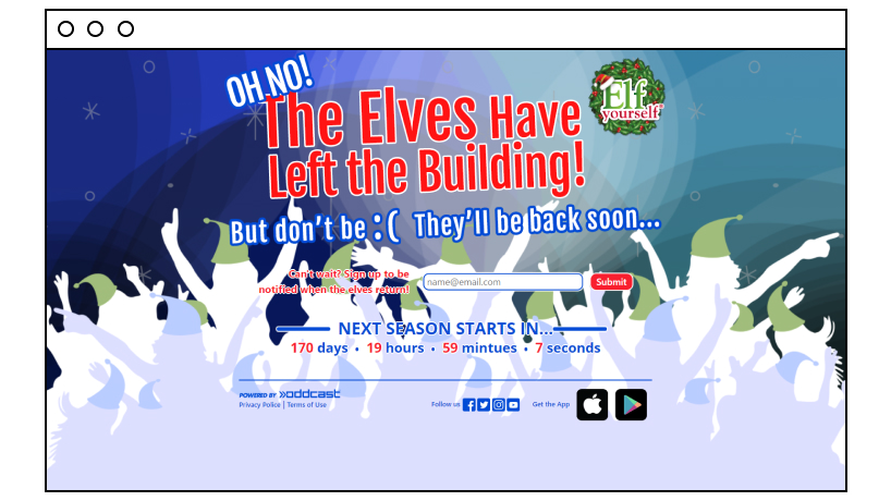
Engaging with users outside of sales and goods, especially on holidays, helps brands create a positive (and more human) image and boost trust. OfficeMax created a funny microsite (you can use it as an app) where you can upload your photo and watch yourself as a dancing elf thanks to AR technology. As you can see from the screenshot above, the microsite is busy collecting emails in the offseason.
8. The Bright Future of Car Sharing by Collaborative Fund
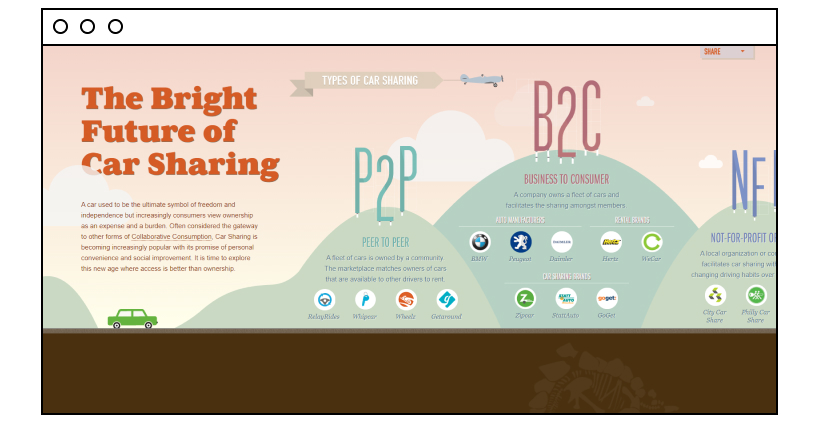
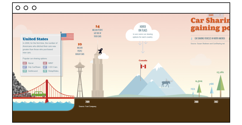
This one-page infographic-style microsite with unusual horizontal scrolling (that reminds of a car trip) is a true journey through the car-sharing concept. As you drive to the right, it covers stats of different countries and educates on the types of car-sharing. The idea is to show how the trend is growing worldwide and prove that “access is better than ownership.”
How to Create Your Own Microsite
As you may have noticed from the microsite designs above, the idea of almost every microsite example was simplicity and entertainment. A microsite is about giving value, not selling it. With this being said, a website builder seems to be sufficient to reach this goal. A website builder such as Boxmode is a perfect solution if you want to start a small business online or, as in this case, launch a mobile-friendly microsite.
So how to create a microsite with Boxmode?
Pick a domain name
Make sure it is relevant to the campaign. By this time, you need to realize your microsite’s purpose and what kind of engagement you want to achieve.
Choose a template and customize it
All Boxmode’s drag-and-drop templates are professionally designed and fully customizable, so you can be sure that your brand consistency won’t be harmed. At this stage, you should also work on the navigation if you are going to have more than one page. Here is some useful advice on the right fonts and website footer design.
Create media accounts
Microsites should have their own social networking accounts. Boxmode templates allow you to plug them in easily.
Set up SEO tools
Adjust optimization settings and increase your microsite visibility in search engine results with Boxmode built-in SEO settings.
Preview and publish
Once you finish editing your website, you can preview it and then hit the “Publish” button in the top right corner of the screen. As simple as that!
A Timely Microsite Boosts Your Business
Does it help sell more? Not exactly, at least it won’t replace a good old landing page. What it does is build your brand’s authority and trust by creating a top-notch user experience. Whether it’s an unbelievable story to tell or a special offer to pamper your audience, a microsite is probably the best tool to deliver amusement.

