In a world where we can instantaneously find the answers to any question we may have, our attention spans have naturally grown shorter. With smartphones and tablets always in our pockets or bags, we are also accustomed to having unlimited and immediate access to seek out businesses in any sector we want at any time. This provides a huge opportunity for businesses worldwide to capture the attention of a plethora of individuals they may never have been able to reach otherwise. It also means the competition is fiercer than ever before. So, how can you capture new visitors and turn them into customers? Build an attractive and useful website.

Your website is typically the place where online visitors make a physical purchase or form their opinion on whether or not they will be customers. One of the most important elements of a brilliantly built website is the homepage design. You only get one chance (and a quick one) to make a first impression, and you’ll want to make it a good one. According to Sweor, within less than a second, users have already formed their opinion on whether or not they will keep exploring your site or move on to something else. This showcases just how important it is to have an exceptional homepage design. While there are several factors that play into keeping visitors on your site, the main elements of a great website homepage design are clear and engaging copy, attractive branding, straightforward navigation, direct call-to-action, and mobile responsiveness.
5 Elements of a Great Website Homepage
A great website homepage design is both functional and attractive. Some elements are critical from a practical perspective, and others are critical from an aesthetic perspective. When crafting your web design, keep these five components at the forefront:
Clear and Engaging Copy and Imagery
What you actually write on your website homepage is just as important as how it is written. Your actual content and word choice should be clear, concise, and to the point. If you have a slogan or tagline, including that alone may suffice. Whether familiar with your business or new to your brand, any visitor should be able to easily decipher what your company is all about at first glance. We recommend you to save any in-depth information or details for other areas of your website that visitors can navigate to. Have the same mentality when it comes to the design itself as well. Choosing simple-to-read fonts, large font sizes, and a color that makes reading seamless on any device is always a good idea. Any images selected for the homepage should be eye-catching and consistent, instead of distracting. Keeping the message you are trying to convey during the beautification process is essential.

Attractive Branding
The original style of your website should be cohesive and well-thought-out. Here is where you get to personify your brand. Your logo design should be unique and recognizable. Whatever colors, logo and stylistic elements you decide on for your homepage design should be carried throughout the inner pages of your website and throughout your online presence as well. The color scheme of your site should play off of your logo to tie it all together. Less is more when it comes to achieving a brilliant homepage design.
Clean and Straightforward Navigation
How can you expect visitors to remain on your site if they can’t figure out how to navigate through it? The menu and navigation buttons on your website should have as few characters as possible. Think short phrases instead of proper sentences. The number of main headings should also be minimal. Having clean navigation helps customers quickly and easily locate whatever information (or products) they are searching for. Also, keep in mind that when your website is viewed on mobile, the navigation menu will have much less space across the top (more to come on the importance of mobile below).

Simple and Obvious Call-to-Action (CTA)
Whether you’re looking to sell a product, grow your email database, get additional followers on social media, or hoping for customers to provide contact information for further follow-up, a strong and direct call-to-action should be prominently displayed. This concept is simple. Your customers will not spend time searching through your website to figure it out. Make it easy and obvious for them to take action immediately from your homepage. Any CTA buttons should be above the fold of your homepage. This is a best practice as your customers won’t have to scroll down along the page (and possibly lose interest) while trying to find it. It should be right there, visible immediately when they land on your homepage.
Mobile-Optimized Layout
The importance of having a mobile-optimized website layout is insurmountable. According to an article published by CNBC, by 2025, over 70 percent of people doing internet searches will use only their smartphone. If your website’s home page is optimized for mobile, it will show up correctly no matter what device a visitor uses to access it. Whether the website is opened on a tablet, cellphone, laptop, or large desktop computer screen, you can rest assured that your visitors will be served an appropriately laid out version of your website.
Now that we have outlined five key elements of a beautiful homepage design, it is time to showcase them using real-life company examples. Here are some of the best website homepage designs across a variety of industries.
10 Best Website Homepage Design Examples
Business and Corporate: KIND Snacks
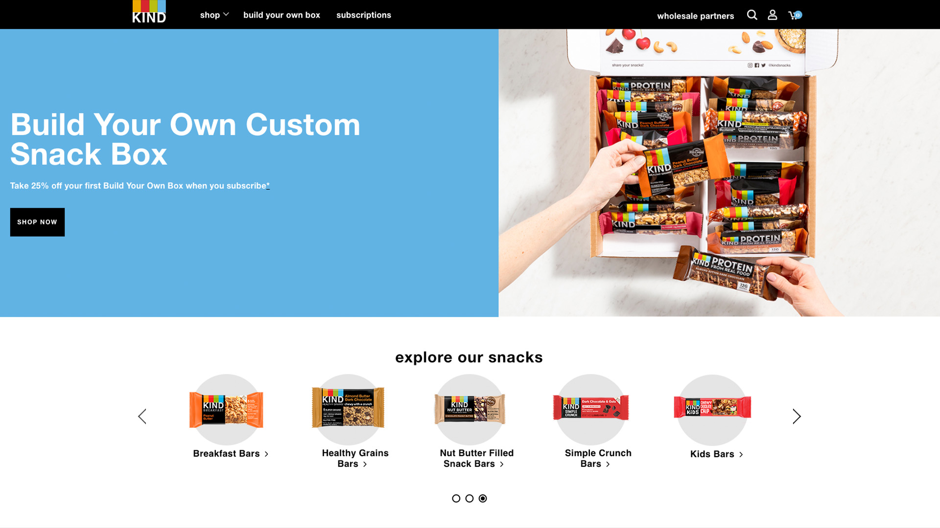
When landing on the homepage of KIND Snacks, you are immediately captivated by the bold color and beautiful large image of their snack packaging. Their navigation is succinct, with only three selection options. To make room for additional pages, KIND made their “shop” navigation a drop-down menu offering additional selections for those seeking further information. They successfully placed their call-to-action button front and center with a simple, direct phrase of “SHOP NOW.” Another brilliant feature of their homepage design is the magnifying glass in the top left corner, which allows users to seamlessly search for something specific.
Charity/Nonprofit Homepage Example: Feeding America
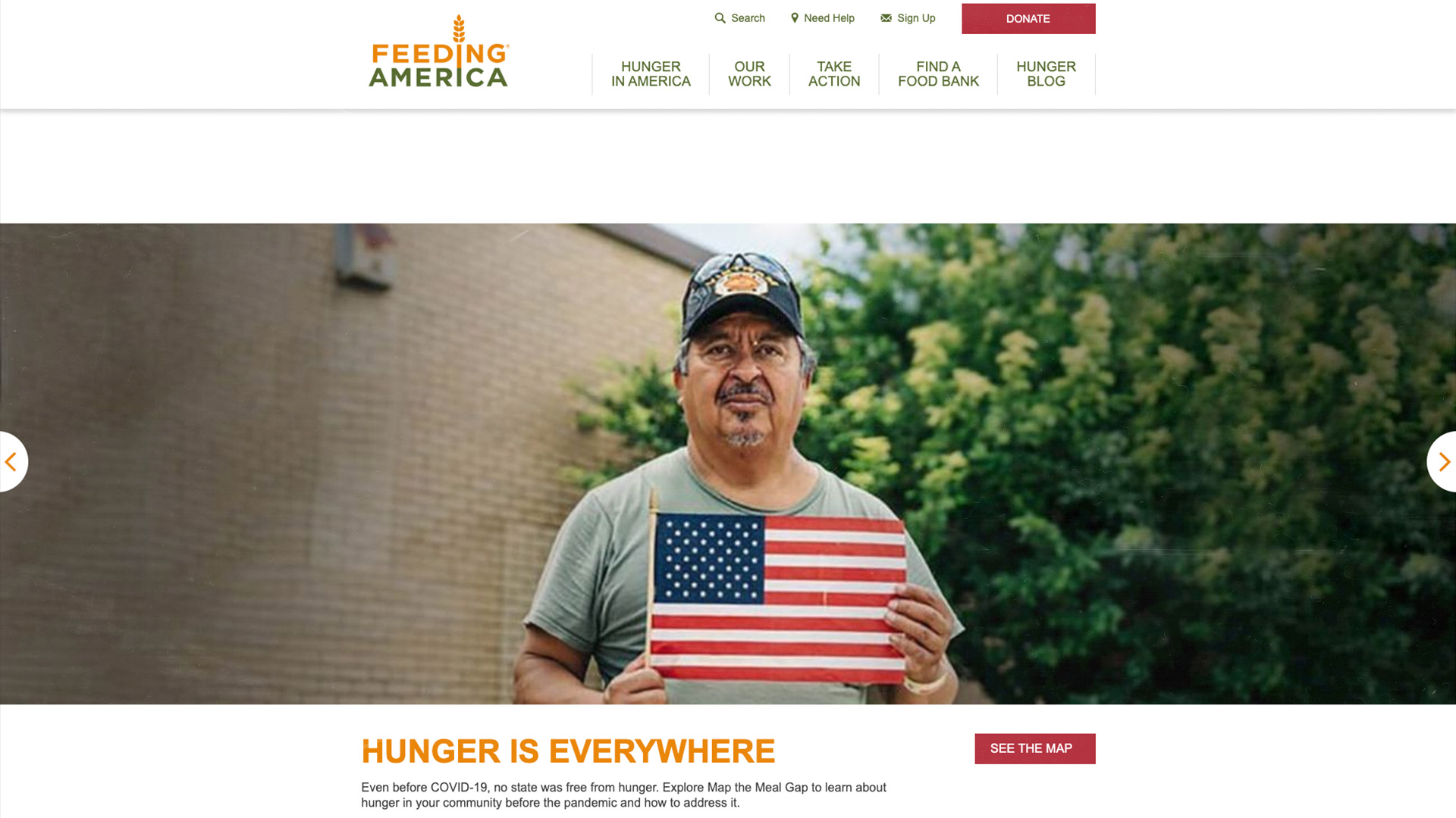
Feeding America’s homepage design is a shining best practice example for other nonprofit organizations. Their design features a main rotating banner with carefully selected images that portray their cause. All of these also have a compelling CTA button like “TAKE ACTION” or “DONATE NOW.” They also have a permanent button as part of their static header that says: “DONATE NOW.” This reinforces the likelihood of a conversion occurring (without overwhelming viewers). Their five-section navigation takes out any of the guesswork for first-time visitors, as they can easily toggle to whichever section best fits what they are looking for.
Health and Beauty: United Healthcare
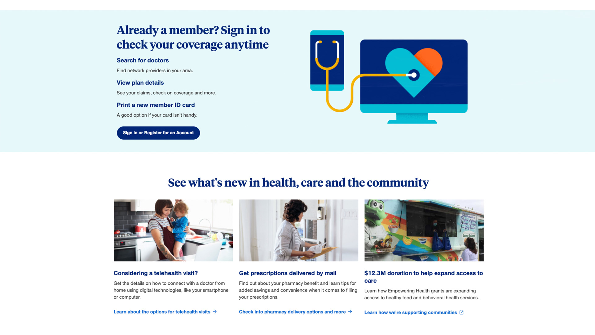
When you think of a health insurance company, the first thing that comes to mind probably isn’t an effective and well-designed homepage. However, United Healthcare nails it with its prominent, well-recognized logo and corresponding color scheme throughout. The site is easy to navigate, which is especially crucial for a topic as confusing as healthcare coverage. They provide customers with the main navigation bar and a smaller, secondary navigation at the top, which effectively points site visitors in the right direction for providers, employers, brokers, or the general public. Though United Healthcare’s website has quite a few call-to-action buttons on the homepage, they are used effectively and designed to stand out. This allows visitors to quickly get the answers they need in just a few clicks.
Fashion Homepage Design: Asos
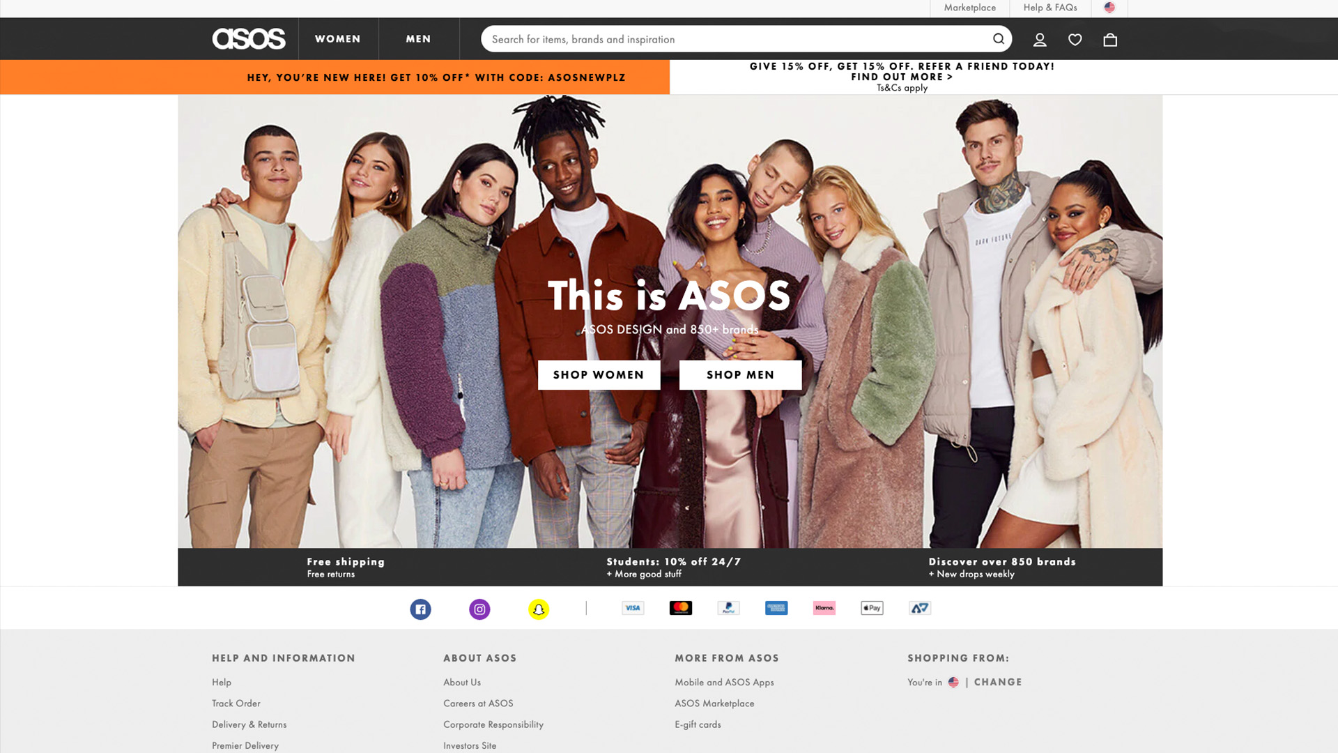
Online shopping brand Asos knows just how to attract shoppers with a minimal, yet effective homepage design. The goal for them is simple, get customers to buy their products (in this case, clothes or accessories). They let their stylish models do the talking in a vibrant, single homepage image that takes over the page with two direct, overlay call-to-action icons of “SHOP WOMEN” or “SHOP MEN” in the center. The navigation on Asos’ homepage mirrors this with a simple “WOMEN” or “MEN” to choose from at the top. This type of straightforward, yet attractive design can very successfully garner that coveted conversion. Plus, more streamlined websites load quicker than homepages with lots of features and content.
Pets Website Homepage Best Practice: BarkBox
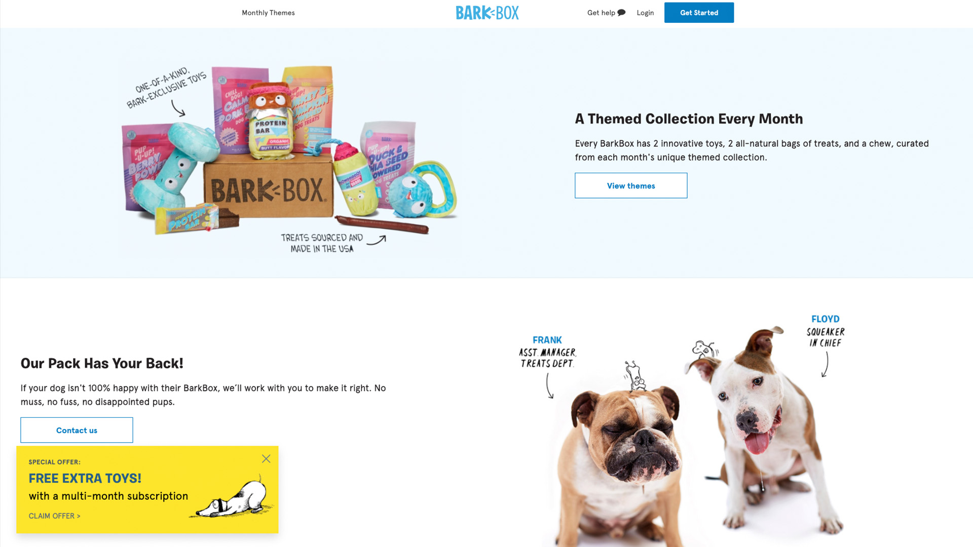
The adorable company headline of “Give your dog exactly what they want,” is one of the first things your eye is drawn to when landing on the BarkBox homepage (that and the cutest furry friend!). A unique homepage feature that works well for BarkBox is a collage of social feed posts tagged by real pet owners and customers using the hashtag #BarkBoxDay. Leveraging social media user-generated content instead of professional images, allows them to incorporate very relatable visuals into their homepage. Seeing those adorable snapshots helps all dog owners envision their own pets receiving their BarkBox. Another fantastic feature of the homepage design is the “Get Help” chat bubble, which immediately pulls up a contact submission form for personalized help and attention.
Example of Real Estate Homepage: Zillow
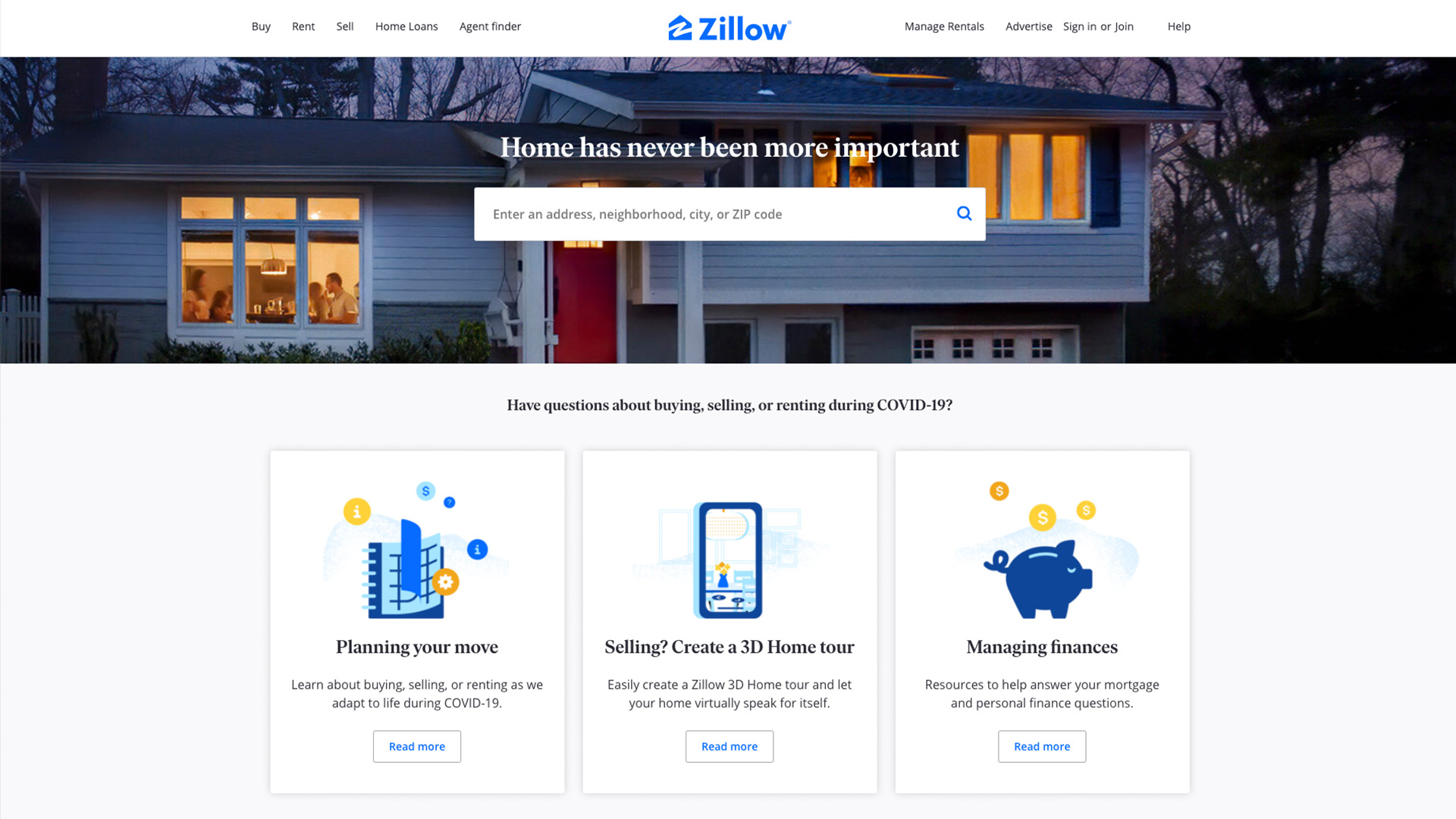
Homebuyers searching for a real estate company tend to have one goal in mind. Zillow’s brilliant web design immediately delivers what potential customers want – a way to search for their dream home at the click of a button. When landing on Zillow.com, the first thing you will likely notice is the big white box, which provides both a call-to-action and a solution through a search widget. Their navigation at the top, though more extensive than some of the others on this list, still effectively uses short phrases to direct people toward whatever services or answers they need. Visitors would not need to steer beyond that first page, a factor that keeps them interacting with the site (rather than leaving).
Restaurants and Cafes: Chipotle
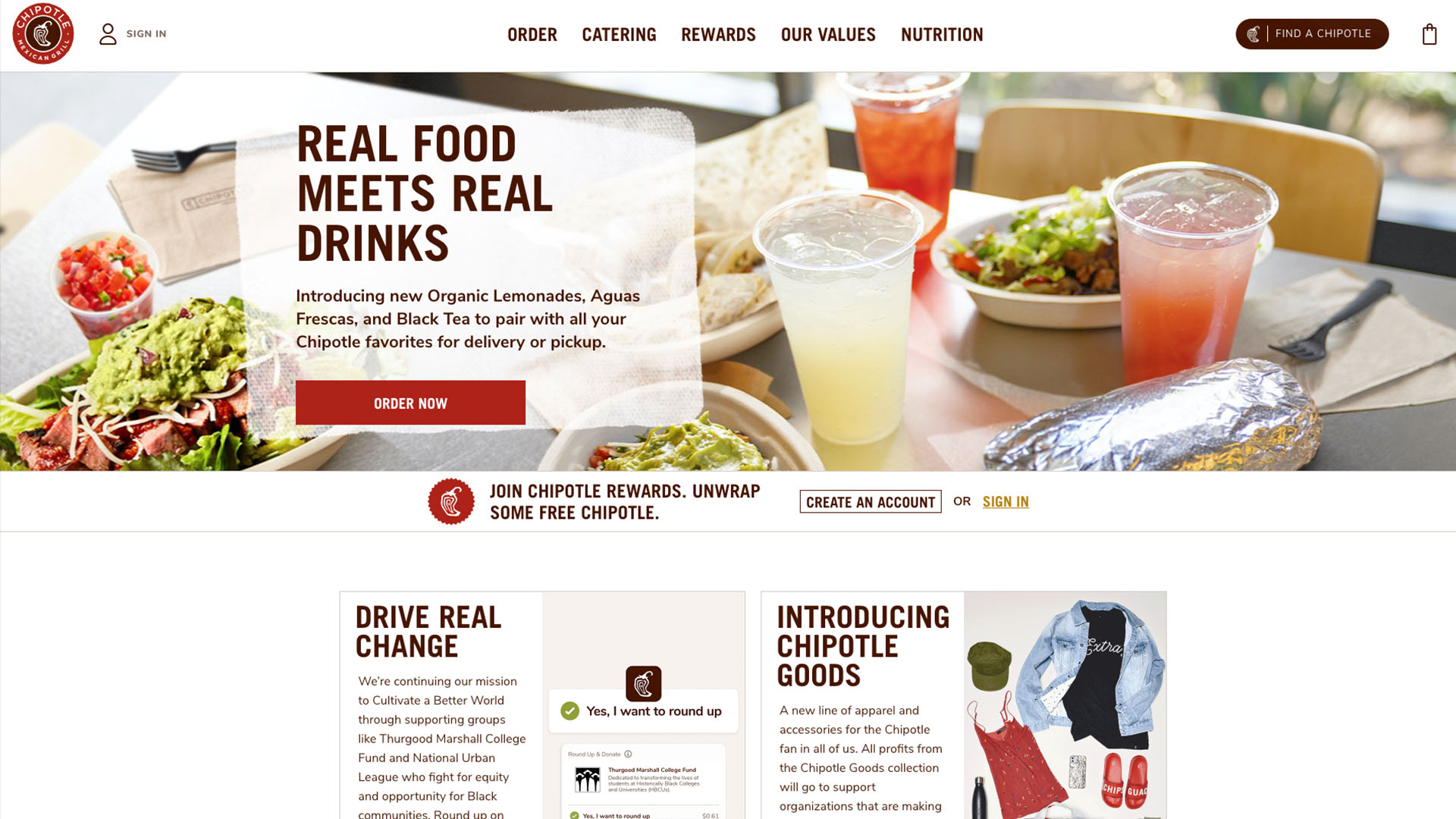
Bite into Chipotle’s fabulously designed website. Their homepage showcases exactly what a user would want – delicious food and an easy way to order it right now. For a company like Chipotle, the most important thing is getting a user to place an order. Their homepage conveniently allows customers to do so by either ordering online or using their “FIND A CHIPOTLE” CTA button to quickly locate the nearest restaurant. Their website is simple to view and navigate. All website text and colors are inspired by its iconic Chipotle logo, giving it a recognizable visual identity.
Another fun feature is that Chipotle embedded an animated graphic that depicts adding toppings to a menu favorite, rather than just a static image in its header. This graphic works not only because it is eye-catching but also because it does not detract from the call to action or ability for customers to easily navigate the website.
Great Sports Homepage: Nike
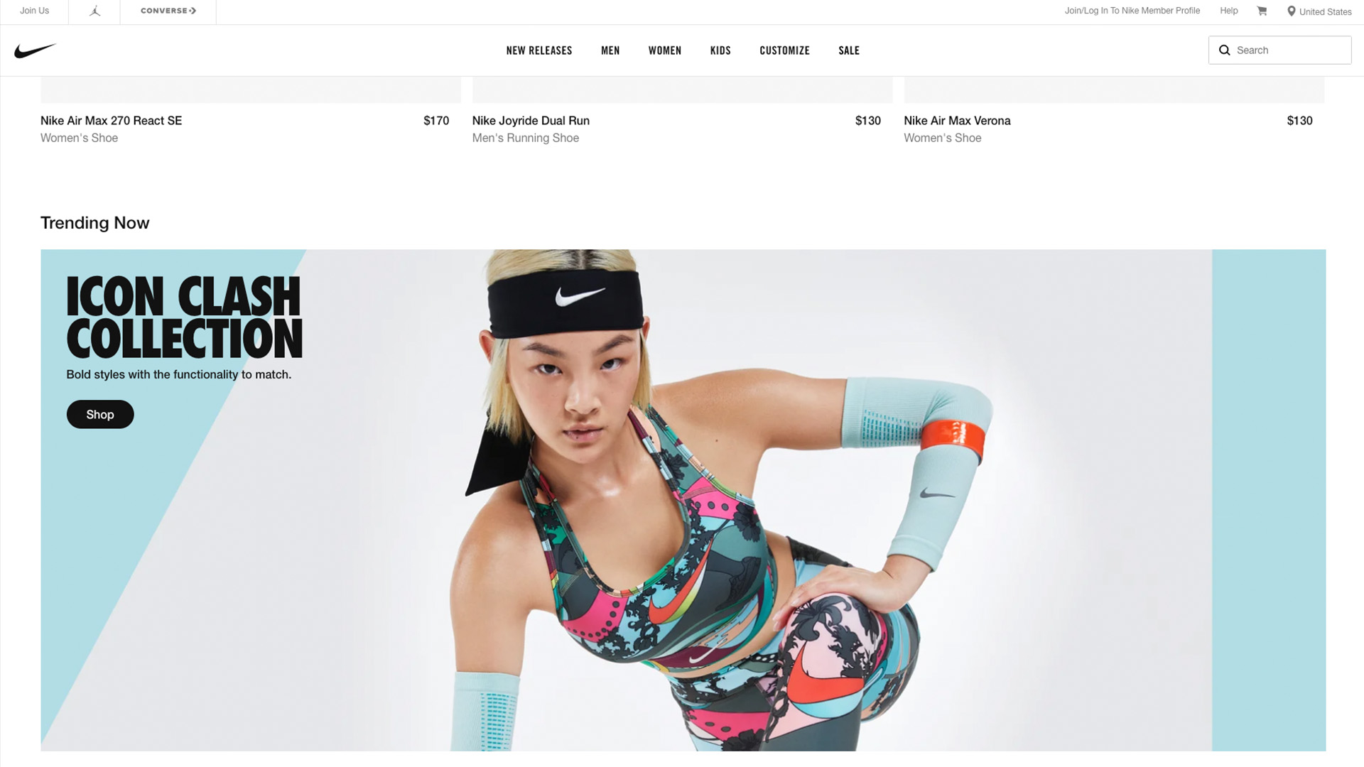
Nike’s homepage design is clean and crisp. Their simple check logo is perhaps one of if not the most recognizable symbol throughout the world. The website design plays off of this and features a white background with black copy text that allows their apparel images to stand out. Though their call-to-action button could be displayed a bit more front and center, it is still easily discoverable and requires no scrolling to find. Nike has a virtually infinite number of products for sale on their site, but searching through them is still intuitive and effortless. All of their options for clothing, shoes, equipment, and accessories have been condensed into a clear menu for easy review. (The most challenging part is actually making a decision on which items you want!)
Technology and Computing: Skype
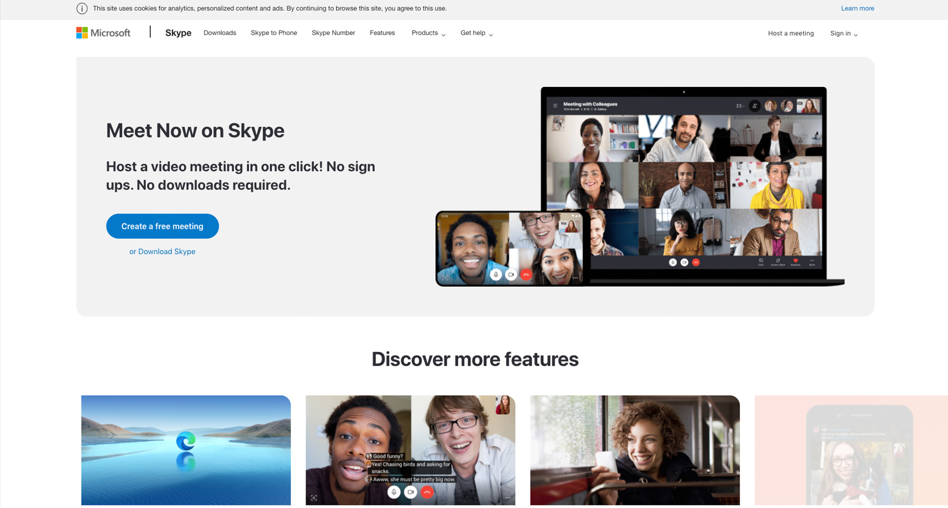
Though Skype’s homepage design is one of the simpler ones on this list, it is still brilliantly effective at capturing the attention of visitors and converting them into customers. Immediately upon landing on Skype’s homepage, you will notice a big bold copy, simple top navigation, and a large blue call to action button in the main graphic image above the fold. Skype’s navigation has six main tabs, two of which are dropdowns that neatly display additional navigation options for those who need it.
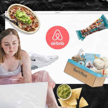
Travel and Tourism Homepage Design: Airbnb
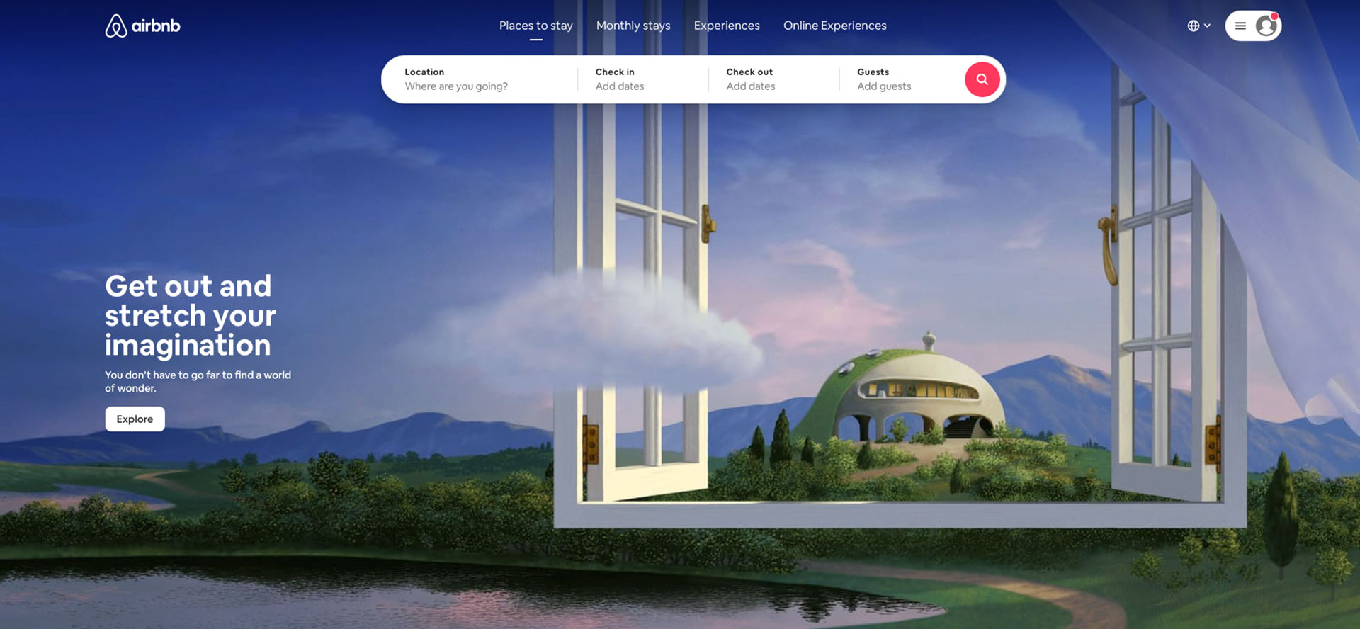
Last but not least is the revolutionary travel brand Airbnb. Their homepage is designed magnificently to allow visitors to immediately search for a rental in whatever city in the world they desire. Their simple black-text-on-white-background design really makes all of the travel imagery and the pink call-to-action button pop out. With only four navigation options, Airbnb does a great job of acknowledging the minimal attention span of visitors and directing them instantaneously toward whatever information they might need.
All of these websites are also optimized and responsive for mobile devices. This ensures that, regardless of what device is used to access the website, seamless user experience will be delivered to the visitor.
Benefits of a Beautifully Designed Homepage
Besides just looking pretty, there are numerous tangible benefits to having a beautifully designed homepage. Some of these include:
– An increased amount of overall time spent on the site.
– Lower recorded bounce rates (or percentage of people who leave after landing on only one page of your website).
– Higher conversion rates.
– Improved brand awareness throughout the web.
– Better SEO (search engine optimization) rankings.
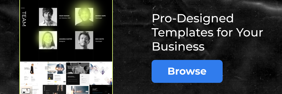
These websites all showcase great examples of successful homepage designs. Don’t consider yourself an expert coder or web design enthusiast? No problem! This does not mean a homepage design similar to the above examples is unattainable. In fact, it’s quite the opposite. Today, there are a number of website builders available to help you get the job done. Boxmode is one of the best website builders available for all proficiency levels, helping your business shine with a brilliant homepage design, effective plugin features, and seamless user navigation experiences.
Regardless of your level of tech skills, Boxmode is a brilliant tool that can be used to design a website for any industry you wish. Use Boxmode to kick off the process of establishing your online brand and designing an effective website. Start out by choosing an eye-catching, well-designed template and build your dream website from there. Boxmode offers many professional templates to choose from that can be easily reviewed as they are sorted alphabetically by industry. Just because you choose to work off of a template, does not mean that your website will not be unique. View the template as a roadmap to get you to your final destination. It allows you to take pit stops, change courses, and fuel up with your own unique flair to get there.
As our attention spans grow shorter, and the competition grows fiercer, it is more important than ever for your company to have a well-designed, well-planned website homepage. Whether your brand and website are already established or are just being built out, it is vital to continuously evaluate your website’s proficiency and effectiveness over time. Think about the five elements of a great website homepage mentioned above and where you fall within them. Ask yourself the following questions to see if your homepage design successfully addresses all of them:
– Is your content clear and engaging?
– Have you perfected your branding and aligned it throughout your site and across the web and/or social media?
– Is your navigation clean, succinct, and straightforward?
– Does your homepage immediately offer visitors a simple and obvious call-to-action (CTA)?
– Does your website’s homepage have a mobile-optimized layout?
If you answer no to any of the above questions, do not panic. Unlike print or traditional marketing, you can make minor or large-scale changes to your website instantaneously at virtually any time. If it is not simple for you to make website adjustments, or if you have to start from scratch, you should certainly consider leveraging a website building tool like Boxmode.
Bring It On Home!
Though every website should reflect a company’s unique sense of individuality, the best website homepage design examples follow identical principles and guidelines for success. Companies like KIND Snacks, Feeding America, United Healthcare, Asos, Barkbox, Zillow, Chipotle, Nike, Skype, and Airbnb all shine within their websites and on the internet overall. The key is in the way they strategically present information and products to their website visitors. Gather some of your own inspiration from your favorite brands’ websites as well. Focus on what they do that has made you a loyal customer and think about how you can emulate it.
A purposeful yet attractive design allows brands to captivate users’ attention for a longer time, achieve lower bounce rates, celebrate higher conversion rates, propel a wider reach of brand awareness and attain better search engine optimization (SEO) rankings. If these are areas you know you want to improve upon, then your homepage design is the perfect place to begin.