
These days, there’s virtually no item we can’t buy, no trip we can’t plan, and no service we can’t hire at the exact moment we want to. Thanks to the little digital magician we carry around with us in our pockets, we can make almost anything we want happen instantly.
According to Statista, more than 50 percent of all internet traffic worldwide is from a mobile device (not including tablets). For the past few years, mobile has showcased its dominance. It’s a trend that all brands must jump on, as it is clearly here to stay. Whether you are using Boxmode to develop your first website or are looking to take your existing domain to the next level, your website should be mobile-friendly.

What is a Mobile-Friendly Website?
Building a mobile-friendly website should be one of the highest priorities for businesses. No matter what vertical your business falls under, the trend is equally as important. A mobile-friendly website adjusts its size automatically when visited on the phone. This guarantees that your site visitors will have either the exact same or a comparable experience on your website from a smartphone as they would on a traditional desktop. It’s no secret that the screen size on mobile devices is drastically different from a laptop or desktop. Without any modifications, it would be challenging for someone to browse your website on their phone. (There would certainly be a lot of zooming in and readjusting!)
With a mobile-friendly website, you’ll see:
- Smaller images
- Copy adjusted to fit within your screen
- Simple, mobile navigation (normally accessible via a “hamburger” icon and drop-down menu)
Why is Having a Mobile-Friendly Website Necessary?
If the fact that more than 50 percent of web traffic is conducted from a mobile device isn’t convincing enough, we have more to share. According to Sweor, almost 60 percent of internet users would not recommend a brand that has poor mobile design and experience. Negative word of mouth from a potential customer can be extremely damaging to a business.

A mobile-friendly website is not only one of the most important elements from a customer experience perspective, but it is also critical from a search engine ranking perspective. As of September 2020, Google implemented a mobile-first indexing initiative. In essence, Google will now be prioritizing the mobile version of every website for two purposes: first, to record and index its pages; and second, to rank them. This means that those websites without mobile-friendly sites are very unlikely to be ranked in a desirable location by Google. On the bright side, having a website that offers visitors an engaging experience and beautiful design on a mobile format will get a serious search engine boost. Unlike other SEO tactics, this one requires little to no added cost.
How to Make Your Website Mobile-Friendly
There are a number of ways to make your website mobile-friendly. Though it may sound overwhelming and technical, don’t be afraid. The following simple adjustments can make all the difference.
1. Implement a Mobile-Friendly Design
One of the simplest ways to create a mobile-friendly site is by using a website builder like Boxmode. With Boxmode, you can implement a mobile-responsive template with just a couple of clicks. Browse through a library of professional themes that are already optimized for mobile devices. When choosing one of these pre-made templates for your site, you won’t have to add any fancy code. They’re straightforward to use and customizable for every brand. Rest assured that when someone lands on your site, it will automatically adjust to whatever screen size the viewer is using. This is especially beneficial for business owners with minimal technical knowledge.

2. Use Simple Design Elements
Even on a large screen, it can be overwhelming to navigate through a complicated, chaotic website. Shrink that down to a mobile screen, and it is a recipe for disaster. Have a “less is more” mentality when designing each page. Eliminate any unnecessary clutter and simplify the design elements on your page. Every piece of information presented should be relevant and complementary to the overall website experience. This can also help tremendously with your website’s load time. Consider your website’s color scheme, as well. High-contrast background and text colors will make it much easier for visitors to read your website while in the palm of their hands.
3. Choose Larger Font Sizes
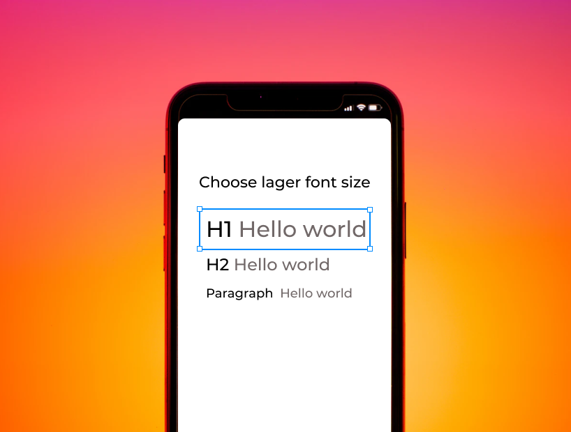
The most basic recommendation when it comes to mobile-friendly sites is the font choice. Though it seems like common sense, this one often gets overlooked. Whichever font you choose should be easy to read. This applies to both its physical size and its style. The smaller it appears, the more the letters seem to overlap. This will be the first thing someone notices when landing on your site. Entice them to read on, not leave. Usually, 14 pixels is the recommended size for computers. However, consider going up a bit, so it’s equally as clear and attractive on a mobile device. Another essential factor to consider is the font type. Though they are unique, customized fonts may not render correctly on a mobile device. To be sure your font choice is legible, stick to standard fonts that match with your design and display clearly at small sizes.
4. Create Intuitive Navigations
Most people accessing websites on their mobile devices tend to be on the go. This makes their attention spans even shorter than usual. According to The Daily Egg, users typically spend under 15 seconds on a website. This number is probably much less when glancing at a website from a smartphone. Make it easy for users to find what they’re looking for, so they can take action quickly. The more sections and pages connected to your navigation, the more confusing it will be to find pertinent information. Consider streamlining your content, so it falls under a few, clearly defined categories. No matter the device, navigating through your website should be natural and seamless.
5. Separate Linked Items

Not all finger sizes are created equal. There’s nothing worse than attempting to click the link you want multiple times (to no avail) because it’s too close to other linked items. (Talk about a reason to bounce!) Adding extra blank space between links will make your site much more user-friendly on mobile devices and eliminate a lot of frustration. Aesthetically, it will also make the appearance seem cleaner. If your site features external links, do an audit on each from a mobile device to ensure that those third-party pages are mobile-friendly. Though the site may be external, it will still reflect poorly on your user experience if it’s not optimized.
6. Reduce Image File Sizes
Another key tactic to make your website more mobile-friendly is to reduce the file sizes of your images. By compressing the image file sizes, you can make sure they render correctly without slowing down the load time. Mobile-responsive templates will automatically ensure the image fits perfectly within the smaller screen size. Take the size of the screen into consideration as well when sorting through which types of images to include. Busy images are likely to get lost on visitors who can’t instantly recognize what they show.
7. Eliminate Pop-Up Messages and Ads

Anything that blocks the text is a huge no-no for mobile websites. Imagine landing on a website searching for information, and the first thing you see is a huge (probably irrelevant) pop-up covering the entire screen. How likely are you to try and find that small “x” to close it and continue exploring? (Unfortunately, most people will probably just navigate to an entirely different site.) This goes for ads as well. Though they may bring in some additional revenue, they are cumbersome on mobile devices. If you need them, make sure they are designed to be responsive as well.
8. Remove Any Use of Flash
If you have incorporated on-site animations, you likely used a program like Flash. Revisit those elements and determine how necessary they are to your overall design. Flash isn’t usually available on mobile devices, so eliminate it completely if you can. There are other technical ways to repurpose those graphics through snippets of code if they are really central to your branding for some reason.
9. Optimize Call-To-Actions & Buttons
Call-to-actions and similar buttons are integral to your website design. These should be not only immediately visible but also easily accessible. This is especially important for when your site displays on mobile. Naturally, your thumb falls at the bottom of the screen, so it’s easiest to click buttons on the bottom area across from the thumb. Think about this when designing any crucial forms that will be available on your website. There are additional features like click-to-call buttons that you may even want to add specifically for your mobile site. These buttons prompt the phone to dial your corporate phone number or customer service department for instant assistance. What is a better way to entice your customers to interact with your company (and improve your conversion rate)?

10. Test Your Site Often
As with anything digital, testing is critical. An easy way to do a quick check is from your personal mobile phone. Open up your browser and visit your website as if you were seeing it for the first time. How does it display, and how easy is it to explore from a new user’s perspective? Are there any flaws or areas for improvement? It’s a good idea to put yourself in the customer’s shoes to view it through an unbiased lens. Another great tool is Google’s mobile-friendly test. It is free and easy to use. Simply enter the name of your website and hit the “Test URL” button. Google will provide you with a mobile screenshot of the rendered page as well as an evaluation of its mobile-friendly status. Additional details like page loading issues are also available. It’s a good idea to test and revisit your site continuously. There are always new trends emerging that you’ll want to stay ahead of.
Benefits of a Mobile-Friendly Website
There are many factors to consider when building a website. Businesses should make mobile-friendly websites a focus from the beginning for many reasons.

Here are some of the most significant benefits:
Higher click-through rates
If websites are optimized on mobile, click-through rates tend to go higher as users visit more pages. The more seamless the experience, the more areas they are likely to click on.
Improved conversion rates
Mobile-friendly websites and e-commerce platforms naturally have higher conversion rates than their non-responsive counterparts. Having a mobile-friendly design can take the customer through the buying process in just a few simple clicks. With prominent on-page buttons and call-to-actions, visitors are more likely to follow your directions. According to Quoracreative, 40 percent of digital transactions are made on a mobile device.
More engagement from potential customers
When your website is easy to maneuver on mobile devices, customers will be much more engaged with your brand. Mobile-friendly websites automatically appear much more professional and trustworthy.
Increased digital shares on social media
Digital sharing on social media is much higher for mobile-friendly websites as social media channels like Instagram and Twitter are predominantly accessed from a smartphone.
Better search engine rankings
Due to global platforms’ focus on mobile searches, mobile-friendly sites naturally rank higher and receive more organic traffic in search engines. (This does wonders for advertising budgets.)
Superior overall user experience
Sites that are built with a mobile-first focus end up with outstanding, straightforward user experiences. They are much easier to navigate and have cleaner, more legible messaging.
Make a Good Mobile Site!
Overall, there are several ways business owners can make their websites mobile-friendly. At a minimum, implementing a mobile-friendly template like the ones available on Boxmode is a no-brainer. Brands should also choose simple design features and larger font sizes for a better experience. Make navigations clear and simple to follow for mobile users. Remove cumbersome pop-up messages and disruptive ads. Consider reducing file sizes for images and eliminating flash animations all together for improved mobile delivery. Optimize call-to-action buttons and separate links, so they are easy to reach/click. Don’t forget to test your site often and watch for new mobile trends like Google’s new mobile-first indexing initiative. Make changes accordingly and ensure your website follows the latest recommendations for maximum performance.
By applying these concepts to your site design initially, you will eliminate the need for many revisions later on. These ten recommendations can have significant results for businesses. The benefits of mobile-friendly websites include higher click through rates, better conversion rates, more engagement from potential customers, additional digital shares on social media, improved search engine rankings, and superior overall user experiences. Who doesn’t want to enjoy those advantages with minimal monetary and time-bound investments? Pick your favorite template, and start building your mobile-friendly website with Boxmode today.