
Your pricing page is your opportunity to let your customers know the cost of the products and services you offer. While creating a slick website using an intuitive website builder such as Boxmode will help you attract customers to your site, the content of your pages will convert them.
![Meet your audience online! [Create site]](https://blog.boxmode.com/wp-content/uploads/2021/09/CTA-2_6-3.png)
Unfortunately, many website creators view the pricing page as an afterthought. They consider a pricing page as a necessary page but not the one that makes a difference to sales. However, this is far from the truth. The pricing page might be the last thing a customer looks at before deciding, and one that’s thoughtfully and intelligently designed can make a massive difference to your conversion rate. Therefore, understanding the most contemporary methods and techniques for building an effective pricing page is essential for website owners and designers alike.
Why Is Having a Great Pricing Page Important?
When planning your website, you spend hours developing the perfect structure, poring over different creative designs, and crafting your content to perfection. A good website designer knows that every page counts, and every page should work hard to convince your customers to buy from you. The pricing page is one of the most crucial landing pages a customer will discover on your website because it can have a massive impact on whether they will buy or not.
People don’t like to part with their hard-earned cash unless they believe they are getting something worthwhile in return, and bad website design can put customers off — fast. A customer has a particular set of needs they want satisfied when making a purchase. They will have specific criteria that you must fulfill to feel motivated to buy. However, even if you satisfy all their criteria with the product or service on offer, they won’t convert if they deem the price higher than their perceived value of the benefits.
Conversely, suppose the price is much lower than their expectations. In that case, they could also perceive negatively as a customer could start to feel doubtful or suspicious that the listed benefits will be effective at that price.

But an excellent pricing page is about more than just listing your products and services at the right price point. There are several other factors and best practices to consider to ensure you create a transparent, appealing, and clear pricing page. One that helps show the benefits and build trust in your offers to convince your potential customers to become actual ones.
Pricing Page Best Practices
1) Keep it simple
Good web pages are simple with well-structured content that makes it easy for users to find what they are looking for. When it comes to pricing page best practices, your strategy should be no different. Keep pages clean, clear, and transparent. Remove anything unnecessary or that’s likely to detract the user’s attention.
2) Avoid jargon and choose your words with care
Make any copy on your pricing page easy to understand. Avoid any complicated sentences, acronyms, or jargon. Keep sentences short and sweet, and remove anything that doesn’t need to be there. Avoid the temptation to bombard visitors with information. Instead, explain what your offer is, its cost, and what’s included in the price.
3) Address any remaining fears
If a user arrives on your landing page, chances are you’ve already hooked them enough to consider buying your product. But it’s not a done deal yet. So make sure you take this final opportunity to address any fears or worries that a customer may have about buying your product. If you handle questions upfront and address uncertainties now, you’ll increase your conversion rate considerably. In addition, you can reassure your customers by including an FAQ and increase trust by highlighting any money-back guarantee or your quibble-free returns policy.
4) Show the benefits
Leave no doubt in a visitor’s mind about why your product is right for them and something they need to buy. If people leave your pricing page still wondering, “what’s in it for me?” it hasn’t done its job. By highlighting the benefits clearly, you can make it a no-brainer for them to purchase.
5) Create a sense of urgency
People hate to miss out on a good deal. So drop some urgency messaging into your pricing page to push potential customers to buy now before it’s too late. And include a special offer, too. Add a countdown timer for a particular deal. Include facts and figures about how many other people are already benefiting from your service. Doing so will increase a sense of urgency and FOMO (fear of missing out), pushing visitors to make the purchase.
6) Include a strong CTA
A strong CTA will ensure that you let your visitors know what they need to do next. If a customer decides to purchase your product, the last thing they want is to become unclear on how to do it. Therefore, make sure you are precise in your communication. Tell your visitors what they need to do and make the purchase process as straightforward as possible.
7) Understand buyer personas for maximum effect
Carefully consider the plans you offer. If you’ve done your customer research and created buyer personas, you’ll make different pricing plans that will appeal to your different customer types.
8) Make a decision and stick to it
While it’s good to take your time deciding on your pricing and using analysis to help make those decisions, you could end up overthinking everything and providing options for every eventuality because you can’t properly decide. This will only serve to confuse your customers and create hesitation. Think about when you’re given a menu in a restaurant with too many options — it’s overwhelming. A few well-thought-out and transparent pricing structures will serve your business far better than numerous plans with a myriad of optional extras that will leave potential customers scratching their heads.
9) Make comparisons easy
It should be easy for those viewing your landing page to compare what’s on offer. Make it obvious the differences between your plans and why some are more expensive than others. You could also focus on different metrics that will appeal to different customers to help them quickly identify which plan will best suit them.
10) Make the best option obvious and offer a free trial
If you’ve worked out which package will be best for your business, push the majority of visitors to opt for this one. You can make your best offer more prominent by changing the header color, putting a box around it to make it pop out from the page, or by creating a CTA that actively steers customers to this option. You should also offer a free trial of your product or service if you can to help make the decision to purchase even more appealing.
Pricing Page Examples
1) smplrspace
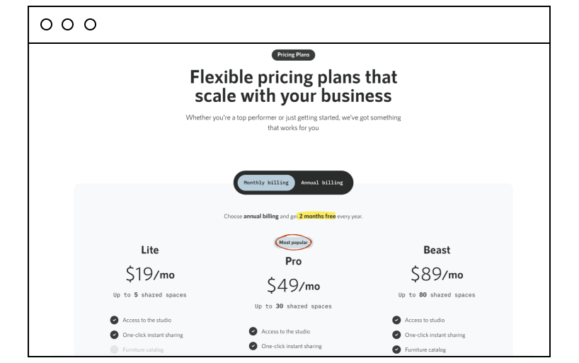
Those working in real estate will enjoy using smplrspace, where you can create 3D renderings from floor plan diagrams and enjoy the benefits of a seriously advanced tech tool to help market properties.
Their pricing page looks really attractive. There are three pricing plans to choose from, and each breaks down the number of 3D spaces a person can generate each month from five right up to 120. It’s easy to see the different benefits each pricing plan provides, and a highlighted CTA at the end of each plan naturally draws a visitor to take action.
Also, there’s a lovely animated way to highlight the most popular pricing plan, which brings your attention right to the trendy choice of the audience.
2) Guru
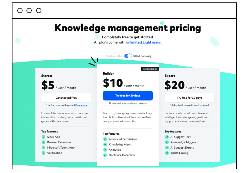
Guru is the remote sharing software tool integrated with Gmail, Slack, Salesforce, and other popular business apps.
On its pricing page, again, you’ll find three different pricing options. What Guru does well in its pricing page design is create an attractive, aesthetically pleasing design. Its structure clearly separates benefits and key features while using 3D highlighting to make the columns more eye-catching.
3) Yac
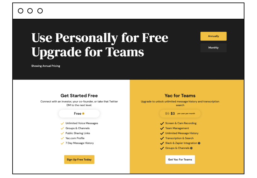
Yac can help increase your team’s productivity by assisting them to communicate more efficiently.
Its pricing page uses buyer personas to dictate where a user might find the information they require. Each section promotes the main benefits and is direct and straightforward — essential for a company that claims to help improve communication. And have you noticed how delicately Yac’s specialists have put a paid-plan promo price into the design? It emphasizes the new price very delicately, but the visitor will definitely see it.
4) Loom
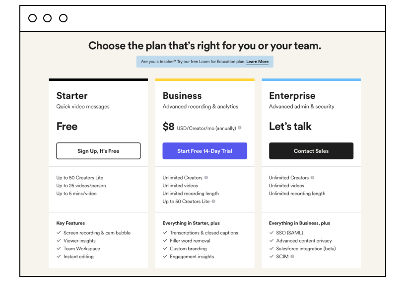
Loom’s pricing page is simple and effective. Its business offers a slick video messaging system, and its pricing page displays options for individual users and teams. The CTA button for the business plan is an attention-grabbing blue and is clearly the one the company hopes will bring the most conversions. A clever sticky header for the other plan options shows there is much information on display. Again, it could be unclear, but the sticky header helps keep the user clear on which plan offers what.
5) Fresh paint
Fresh paint is ideal for companies looking to harness their user data and use it to boost their businesses. The pricing page splits into two white columns, which stand out against a background of navy blue. Simple and tasteful. The company also includes a comprehensive FAQ section that helps visitors gain further insight into how the app works.
6) Appcues
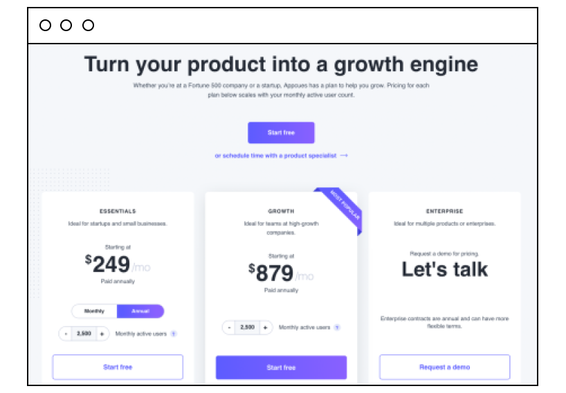
Appcues helps you drive customer loyalty, improve the onboarding process, and see how users interact when using trial versions of their product.
Appcues pricing page is another fine example of highlighting the optimum plan, giving the Growth plan more space and demanding more attention from visitors. It also added a subtle shadow around this box to draw the eye toward it and make it pop out.
7) Liverecover
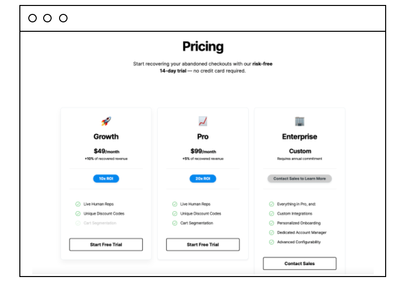
An abandoned cart is frustrating for any business owner, and Liverecover can help them understand what went wrong by calling up customers who’ve left their carts to find out why and turn them around.
The pricing page is clean and simple, only offering the most crucial information without overwhelming detail about its services. Here, potential customers can discover the best features and decide what’s right for them. Using emoji in design makes it look trendy and can help attract a younger audience.
8) Contractbook
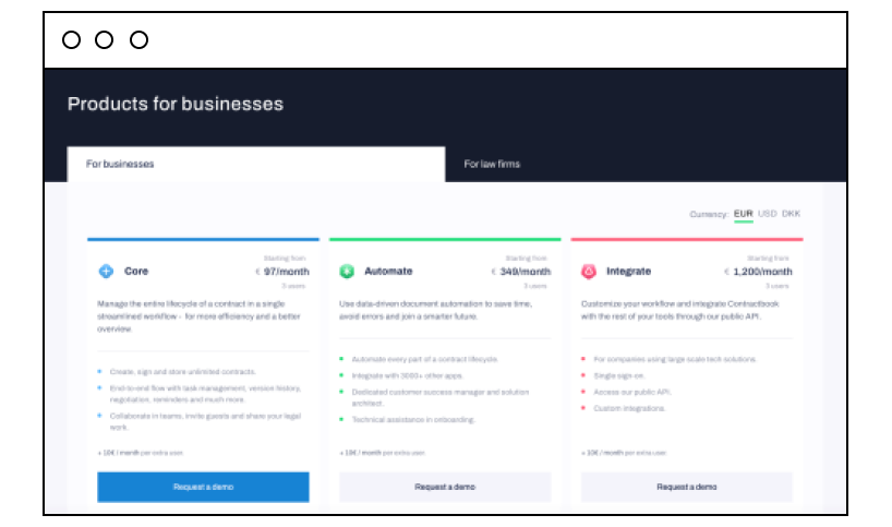
If your business needs to manage multiple contracts, Contractbook can be extremely useful. There are two pricing options for businesses and law firms, further divided into separate pricing structures. The simple design has a significant impact. Each column is in a different color, with bullet points separating various features. This is an excellent example of conveying a lot of information without overwhelming visitors with a massive block of content.
9) Contractbook
Kajabi provides businesses with an easy and intuitive selection of software tools that can assist their marketing, ecommerce, integrations, and data analysis efforts. These three pricing options on this pricing page are clearly separated, and the mid-level option has a bright blue border making it apparent that this is the preferred option and the one the company wishes visitors to opt for. In addition, there is lots of white space, making for a simple, uncluttered design that just does what it needs to do.
10) Corpayone
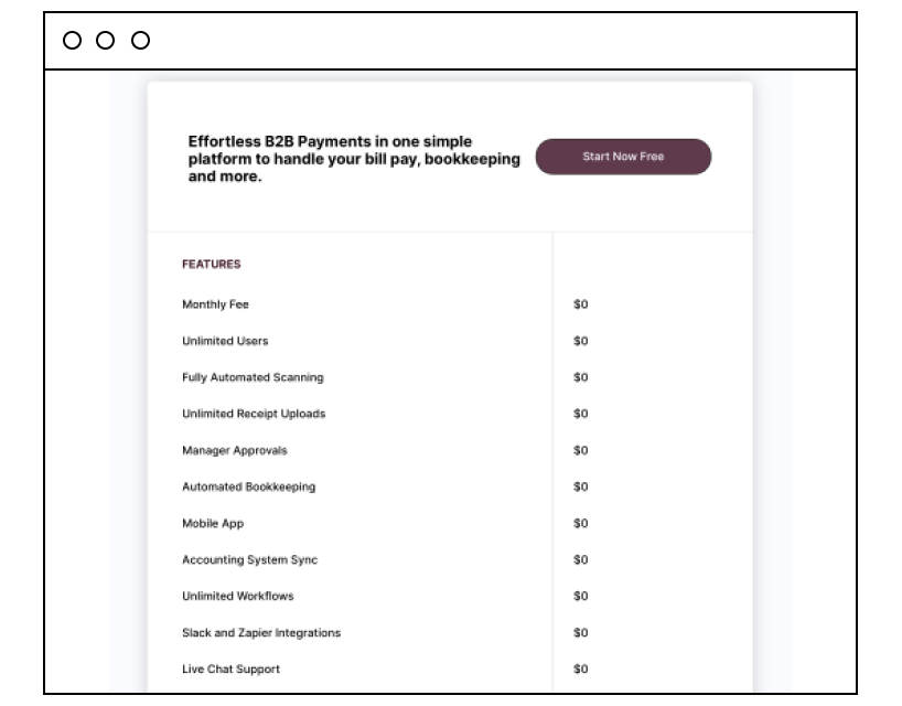
Smart accounting software comes in the form of Corpayone, which helps businesses keep track of their finances with ease. Its pricing page is utter simplicity. It’s so straightforward and transparent that visitors can immediately see what it will cost them to go ahead with a purchase and what they will get in return. The dark button on a light background stands out perfectly, and the visitor will undoubtedly want to press it.
Make your pricing page stand out
By following the above tips, you can ensure that your website’s pricing page stands out. Website monetization is essential, and by implementing the strategies above for pricing page design, you should see a rise in sales, customers taking action, and more income rolling in.