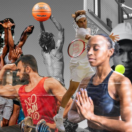
Now, more than ever, people are focusing on their health and wellbeing. Even as little as a decade ago, the information around health and fitness and options for exercise was minimal compared to the vast wealth of information you can find online today. So if you are hoping to compete in a marketplace already bursting to the seams, your fitness website must be eye-catching, engaging, and informative.
More and more adults are exercising at home and using online platforms to do so. In fact, a March 2020 study found that around 16% of adults in the USA had taken to following exercise videos online.
While fantastic, original, and valuable content is always going to make your site visitors happy, it’s also up to you to think carefully about the design of the fitness website, and how best to arrange the information in a way that will impress and assist your customers. Thinking about your fitness business from this perspective will gently guide users along the customer journey to the point where they will be eager to buy into your product or fitness plan.
Check out Boxmode’s amazing sports and fitness-related templates. It’s so easy to create your own website and adjust them to your taste with our intuitive drag-and-drop, regardless of your tech skills.
So how do you create an excellent fitness website that attracts attention? First, you need to do your research. Below we have listed fifteen best fitness websites you’ll discover this year, selected for their smart design, great content, arresting images, and attention-grabbing typography.
#1 Timberwolf Fitness
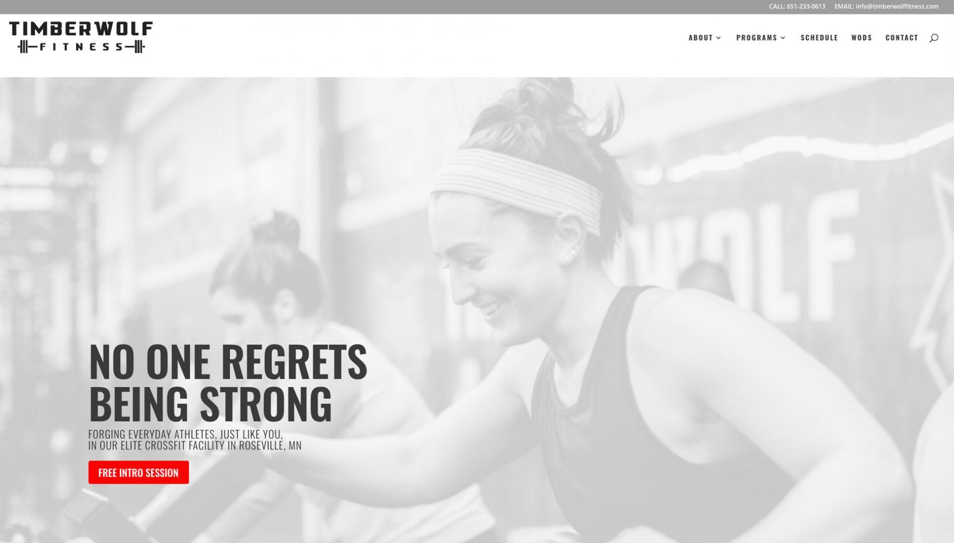
Timberwolf Fitness has gone for bold simplicity in its design with a striking color scheme that ensures that the reader’s eyes are drawn to the most critical bits of information. Their tagline is motivational and inspiring, and you can see from the homepage that their CTA is clearly highlighted, enticing the reader in. The typography is bold and bright, so it’s easy to digest the information presented. The faded background images add some slick style, giving it a contemporary feel without being too flashy or in your face.
#2 Program10
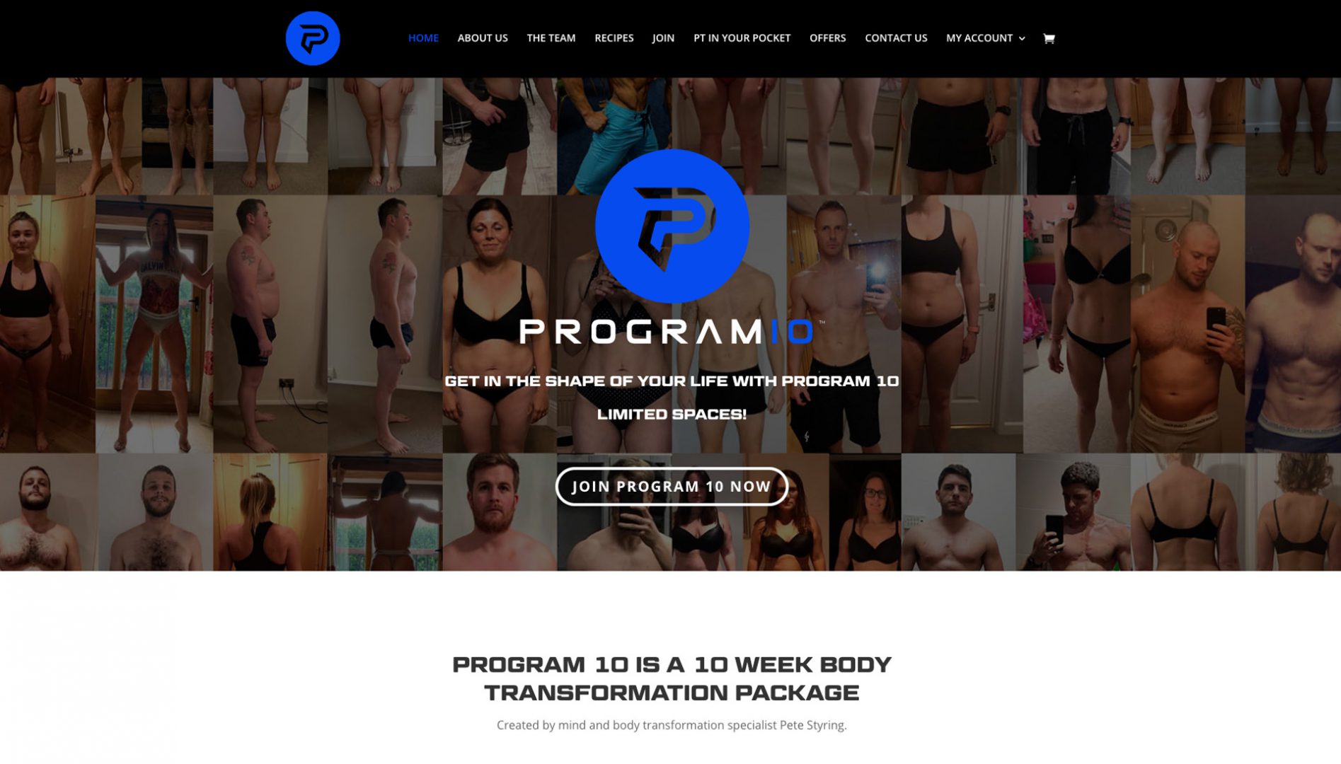
Aspiring web designers can learn a lot from fitness website, Program 10, who have chosen to keep their site full of honest imagery. The animations draw the reader in and keep them glued to the page. A fitness website wants to motivate and energize, and Program 10 does just that. They’ve also included plenty of social proof above the fold, so viewers don’t need to scroll down to know that this package will deliver significant results. The website is clearly laid out and easy to navigate too.
#3 The Boxing Academy

The boxing academy engages viewers with an eye-catching video on the home page that keeps us watching and holds our attention. The link to view the class schedule makes it very easy for visitors to find relevant information. The design is super slick and modern, and the color scheme works well with the offering. The scrolling animations are also admirable and add interest to the page. You can also find testimonials from satisfied customers on the homepage as you scroll down.
#4 Livestrong
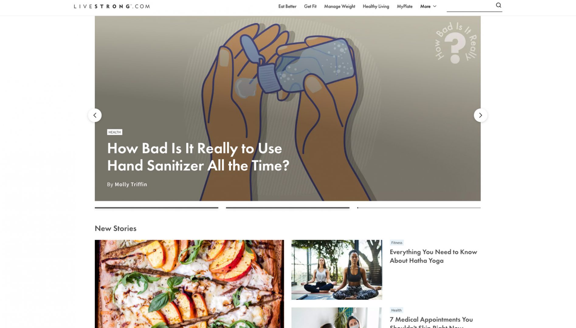
Livestrong is an incredibly well-known fitness and lifestyle brand, and its website design reflects its success. Not only can visitors access a wealth of health and fitness information upon entering the site, but there is also access to fantastic forums. The site is updated several times a day, meaning visitors have access to all the latest news and industry trends. The menu at the top is action-based, which drives customers to stay on the site. There are lots of links and images which engage the reader and plenty of white space to ensure that visitors don’t feel overwhelmed.
#5 Daily Burn
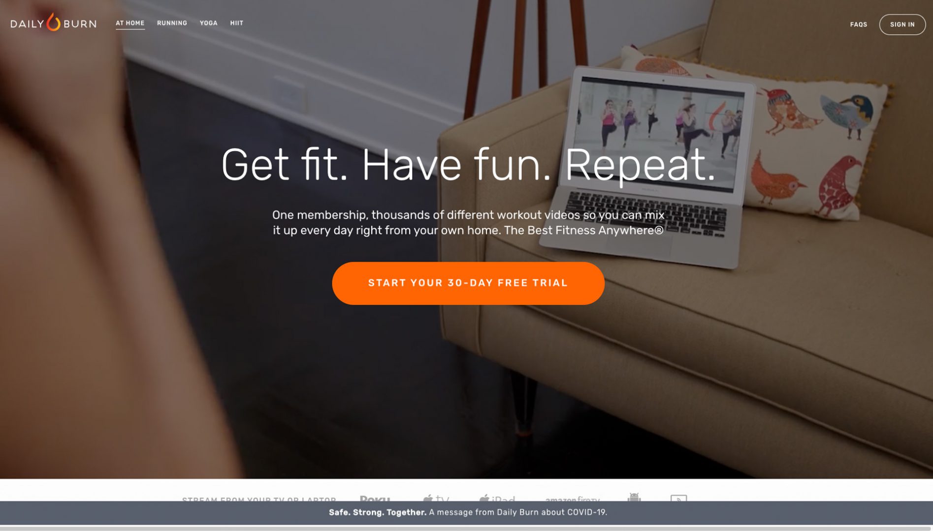
DailyBurn is an excellent site that features professional fitness instructions for people looking for a variety of workouts, whether you are a beginner or a fitness fanatic. Their tag line, ‘Get fit. Have fun. Repeat.” is simple, to the point, and useful. Their sell is that the workouts are easy-to-follow and in-depth, and users can scroll through the thousands of fitness videos on offer to find a vast range of classes. It has a contemporary feel, features an engaging video above the fold, and cleverly highlights CTA’s and vital information to ensure customers don’t leave the site without signing up.
#6 Ulrik on Hands
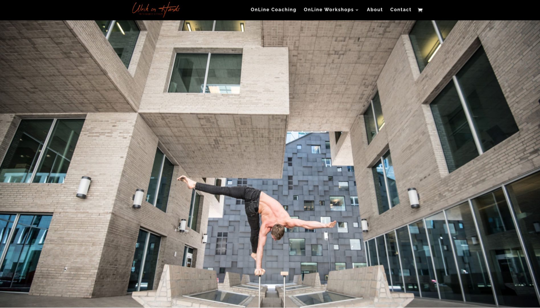
This fabulous and unique fitness website engages viewers with it’s astonishing and frankly mind-boggling background image that depicts something awe-inspiring. The design of the site itself is clean and smart, and its unfussy layout and easy-to-understand information will appeal to many.
#7 Dara Hart
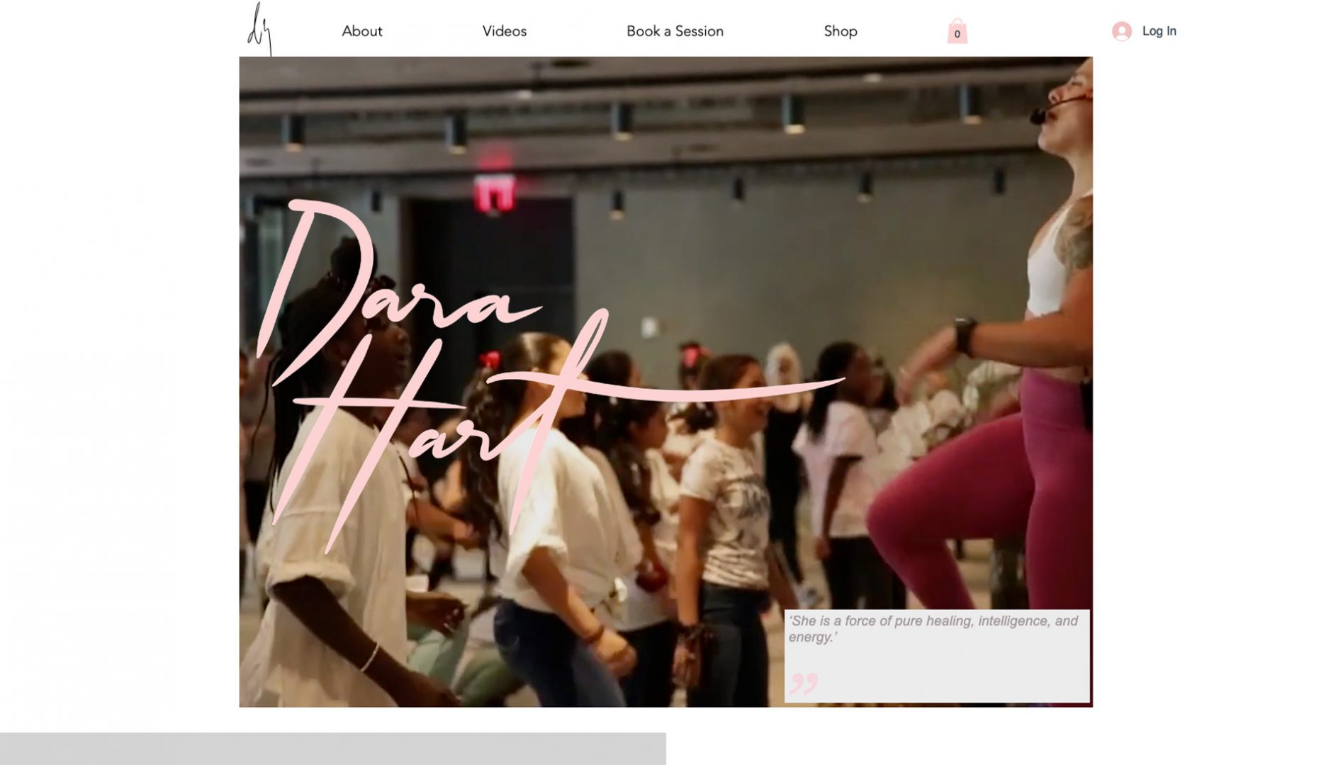
Dara Hart’s personal training website has a lot going for it. With a clean, fresh look, a pastel color palette, and bags of personality, she uses different mediums to highlight what she can do and attract a range of readers. Through engaging videos, powerful images, and text, she establishes herself as a friendly professional who’ll deliver exceptional results. This is further cemented with testimonials from well-known celebrities, and Dara’s own signature adds a personal touch. The site is also littered with smart CTA’s to keep the reader interested – from booking a PT session to subscribing to her mailing list; she makes it almost impossible to leave without taking action.
#8 Berlin Athletic
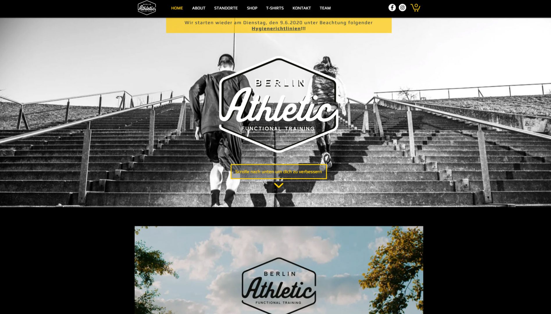
The Berlin Athletic fitness website works on many levels. It immediately engages users who land on the homepage with a striking full-width photo. The call to action button is clearly highlighted, providing a fantastic contrast with the crisp blank and white image. The CTA offers users a free trial, which helps those who are a little more risk-averse feel inspired to try out the service. The color scheme throughout the website remains mostly black and white, with essential bits of information highlighted to draw attention and direct the reader’s gaze towards them. There is also no need to contact anyone to purchase sessions, and customers can complete the transaction with a few clicks of the button, making the whole process seamless and hassle-free.
#9 Blissed
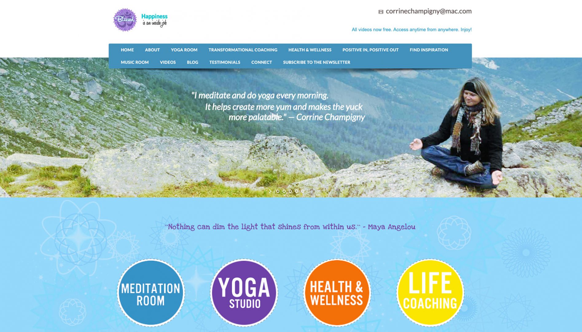
Blissed is a virtual yoga and wellness resource with a design that perfectly radiates its messages of peace, strength, and inner calm. With scrolling images and quotes to inspire and delight the reader, it then clearly separates the services on offer with bright buttons, adding a sense of lightness and fun. The carefully selected images exude positivity and reflect their brand, which is all about happiness, laughter, learning from nature, and being healthy. The site also boasts lots of great features such as video classes and offers lots of support to customers such as an online booking system and live chat option to reassure them that help is at hand should they need it.
#10 Hallard Fit
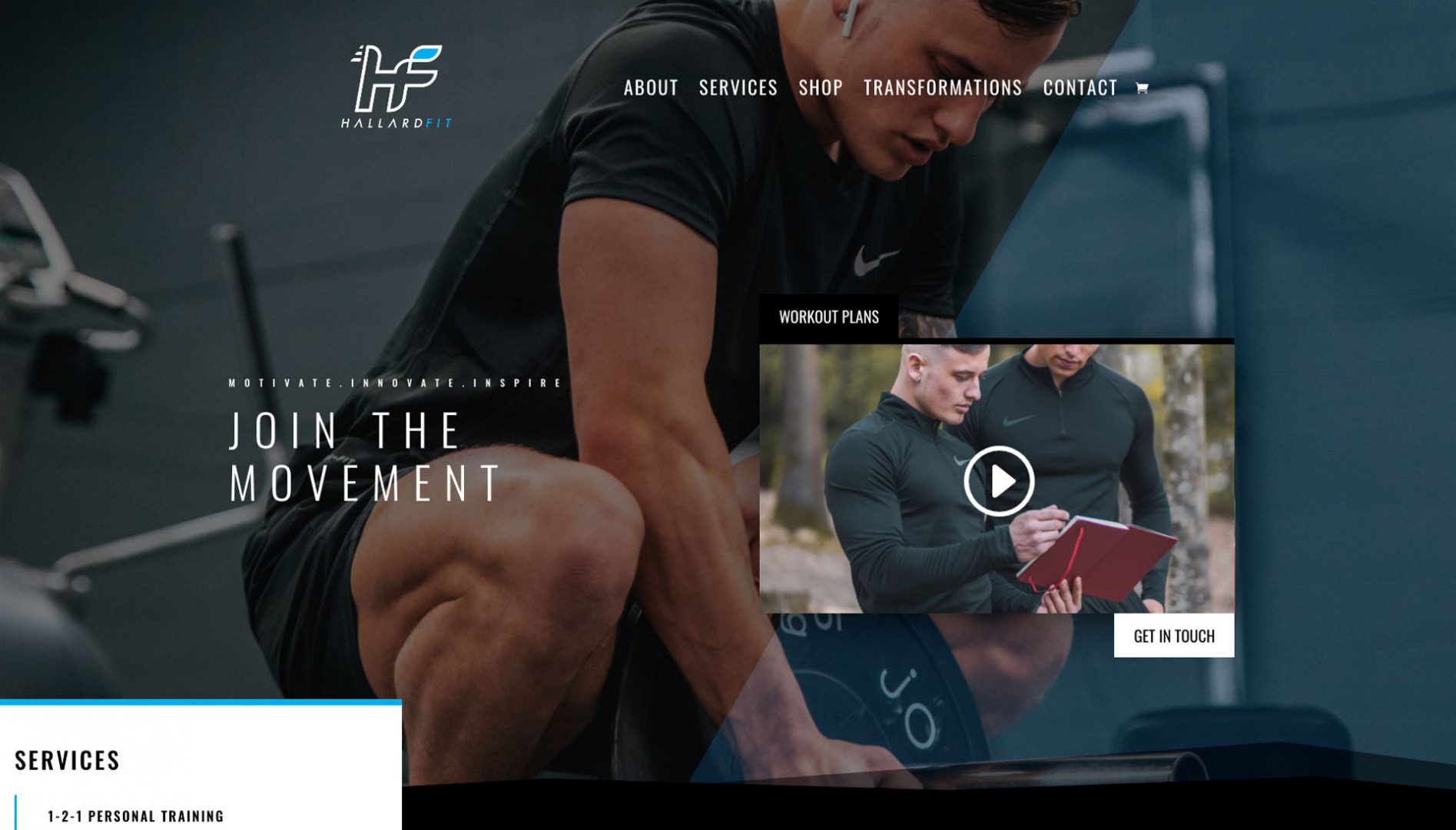
Hallard Fit is another effective personal training website that uses smart design features to create a powerful brand and fantastic user experience. The thin, spacious font is unique and eye-catching and stands out nicely against a dark background. The logo is clearly displayed and has a modern feel, and there is an engaging video placed above the fold so users can easily see what it’s all about. The transformations section provides social proof. There are plenty of CTA’s placed throughout the site, all of which lead to a contact form where customers can begin their fitness journey.
#11 Albany Academy
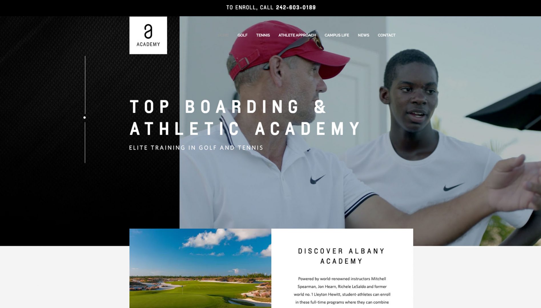
The Albany Academy is a Golf & tennis training website that cleverly combines video, web animation, and imagery to showcase a slick, compelling brand that engages the user as soon as they land on the homepage. The sleek website design is sure to impress, and the smart use of monochrome throughout the site gives fantastic contrast to the color photographs that showcase what’s on offer. There is also a wealth of information about the academy itself, which builds trust and authority. However, the content is broken down into digestible chunks, making it easy for readers to skim and absorb.
#12 Jennifer K. Wellness: Yoga & health coaching website
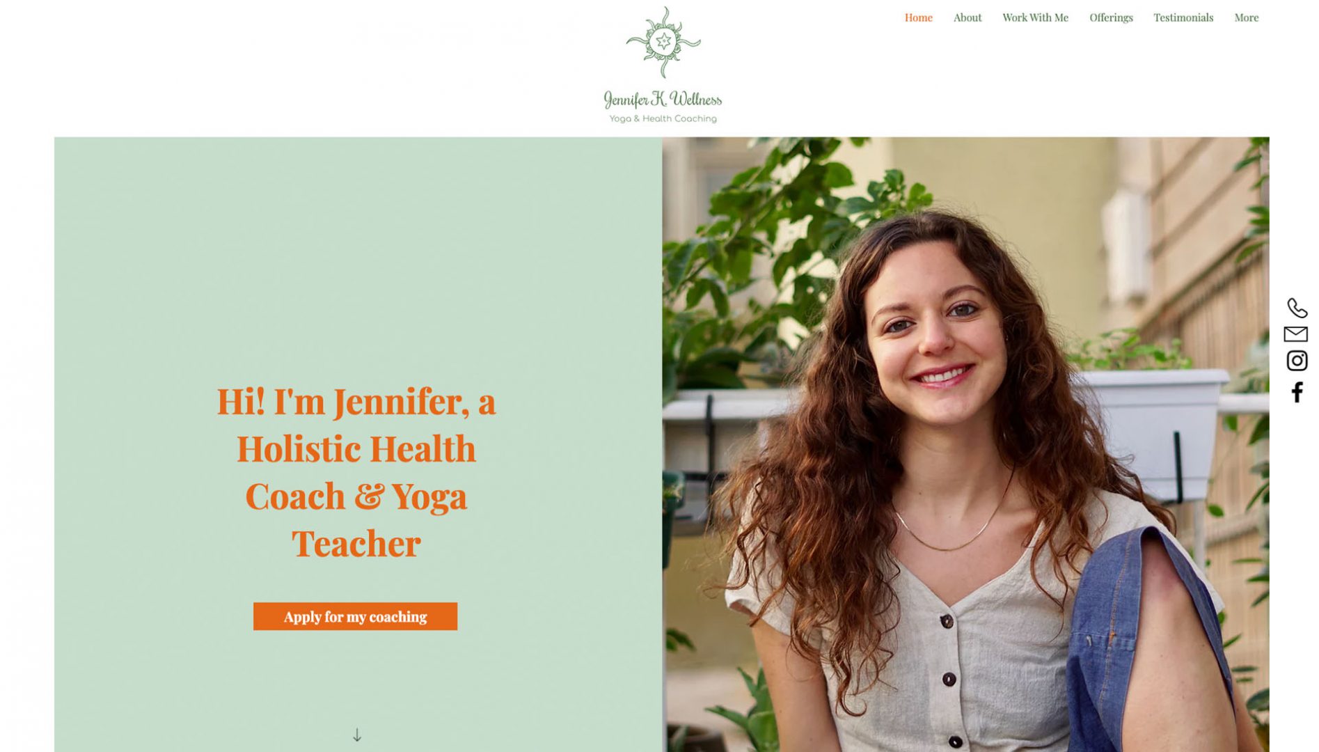
The holistic health coach and wellness teacher, Jennifer K, leads by example with her gorgeous yoga, health, and wellbeing website. It is perfectly crafted not only to engage the reader but also to give them a sense of the kind of peace and wellbeing they might benefit from should they join her. Her design is simple, using mostly different shades of calming green, peppered with orange to highlight the most critical pieces of information. She includes testimonials for social proofing, and the whole site evokes a sense of health and wholesomeness that perfectly aligns with the offering and brand.
#13 Crossfit Argentoratum
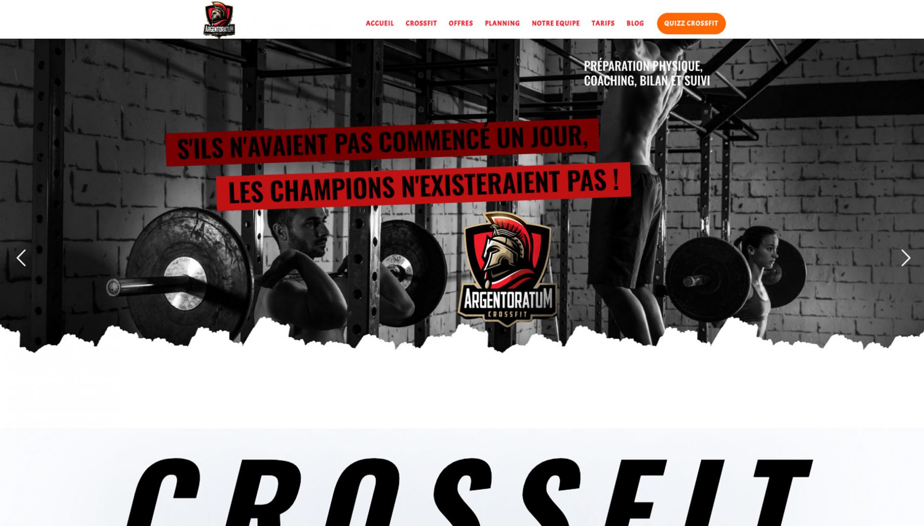
This fantastic fitness website uses bold colors and a striking design to showcase the services on offer. The dark color scheme and powerful imagery give an impression of boldness and strength, which will appeal to those looking for great fitness results. The powerful branding combined with a slick design, bold typography, and strong CTA’s littered throughout make this a fantastic example of how a fitness site can draw users in and convert them into paying customers.
#14 Beach Shack
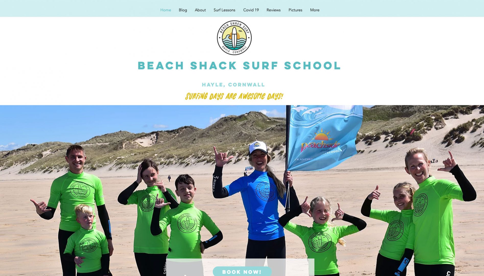
This popular surf school website gives off laid-back yet sporty vibes with its summery color palette of bright yellows and cool blues. With a typically funky logo and strong use of imagery, customers are immediately carried away to a fun day at the beach where children and adults alike can learn to ride the waves. The site not only offers lots of useful information, support, and reassurance for those new to the sport. It also provides many engaging blog posts and links to lots of positive testimonials from happy customers too.
#15 Echo Fitness
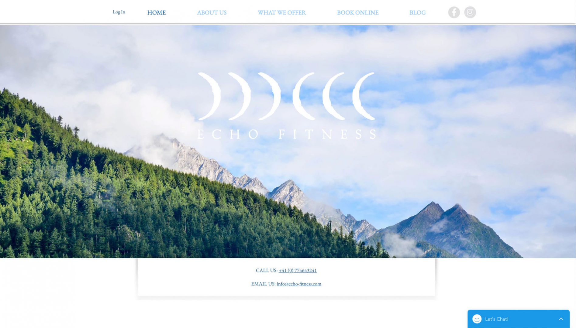
Echo Fitness is a personal training website focusing on wellbeing and lifestyle changes that encourage clients to embrace nature, push themselves, and be the best they can be in terms of physical and mental health. The stunning imagery is both striking and impressive and immediately allows the user to imagine themselves in such a remarkable location. There are high-quality images throughout the site that embody the varied offering of this unique business. Customers can also book online with ease by selecting a package via the ‘Plans & Pricing’ page.
Fitness websites that are built to encourage a more active lifestyle should, by nature, be engaging, energizing, and interactive. These fifteen websites showcase the best design features, content, and stylistic elements. All of which can be utilized to create a fantastic, inspiring user experience that will motivate people to act and ensure the success of your fitness business.