The phrase “self-care” has come up more frequently, particularly over the last nine months. The importance of looking after your mental, physical, and emotional health has become a pressing priority for men and women of all ages.
A trip to a beauty salon can be a fantastic way to unwind or spend some quality time with yourself, your partner, or your friend. Booking a treatment at a beauty salon is a great act of self-care that can leave you feeling refreshed, relaxed, and ready for anything.
It is therefore important for beauty business owners to ensure they have established a robust online presence. Building a beautifully designed and informative website using a professional web builder like Boxmode can help show your products and services in their best light. A website is often the first port of call for potential customers to search for the services they want, and they may click on several before deciding which beauty salon to book with. If your site is clunky, slow, cluttered, or visually unappealing, this could be off-putting. If your site is seamless, clear, and full of attractive, relevant imagery, it could motivate a visitor to book the appointment with you over your competition.

For beauty business owners creating a prominent web presence is a must, and there are many things to be aware of and keep in mind as you build your site. Make sure your design is user-friendly, and the navigation is smooth and effortless. You must also ensure that your text is readable, comprehensive, and error-free and that the site is mobile-friendly too.
An attractive, sophisticated, and elegant website is also essential. Here it would help if you considered what impression you’re trying to evoke. Is your salon innovative and cutting edge? Are you trying to evoke a sense of calm and quiet? Researching your ideal customers and thinking about how you want to place yourself in the market and what your USPs are will help you shine through the competition.
Beauty Salon Website Design Inspiration
If you’re just setting up your beauty salon website, the best way to figure out your vision is to look at what your competitors have done and note the features you admire. Below is a list of 12 fantastic examples of salon websites that really make their mark.
1) Salon Safari
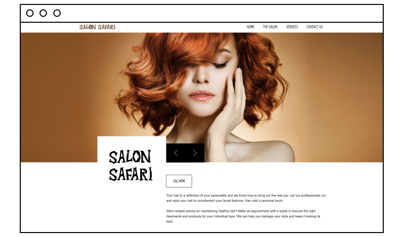
A good website’s markers are compelling content, striking visuals, straightforward typography, and a smart design hierarchy. Salon Safari ticks all these boxes giving an overall impression of sleek professionalism that’s sure to impress visitors. The content here makes the site stand out since it works hard to sell the services and demonstrate to potential customers they know what they’re talking about. If they needed more reassurance, the addition of the testimonials carousel is another excellent way to build trust through social proof. It’s simple and easy to navigate through the booking process too.
2) Fringe Hair Salon
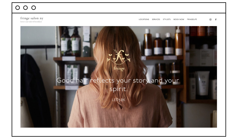
Fringe Salon has an intuitive home page design, making it easy for visitors to navigate seamlessly through the site. The language is friendly and natural without any big sales push. The imagery is attractive, providing excellent visuals that will appeal to potential customers. There is also a clear “book an appointment” button from the home page helping visitors navigate the appointment booking system with ease. Fringe’s website has all the elements that a good hair salon website should have. The creators also include acknowledgement in prominent magazines, which the salon can use to build customer confidence and gently push visitors through the site toward making a booking.
3) Toni and Guy
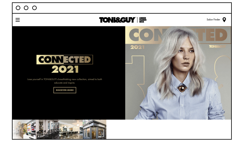
When it comes to creating an exceptional salon site, excellent photography goes a long way. Toni and Guy show us how it’s done by using crisp, striking images to showcase their services and establish themselves as a world leader in the beauty industry. Shelling out for professional photos can be costly but could well pay for themselves because they’re effective at persuading potential customers that the salon is top-notch and can offer a level of expertise that perhaps the competition cannot.
4) Jo Hansford
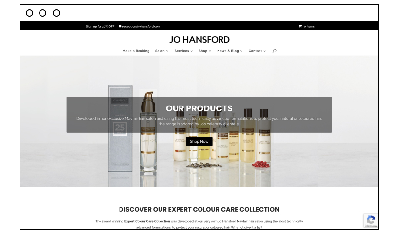
Jo Hansford keeps things simple, clean, and minimal. This site is an excellent example of presenting a contemporary, polished beauty business that gives off an impression of elegance and professionalism. The site entices customers straight away with a pop-up offer for 20% off product orders in exchange for customer newsletter signups. The navigation is simple and very clear, and there’s lots of white space that helps readers focus on what is essential and evokes a sense of calm.
5) Muse Salon and Spa
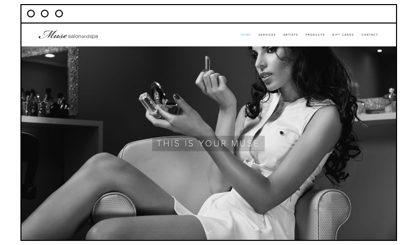
Muse Salon and Spa is an excellent example of how to use a parallax effect throughout the site. The site greets the visitors with a striking grayscale image of a stunning model. Then, as they scroll down the page, visitors are shown a picture gallery that depicts the best of the salon’s services. This is undoubtedly a great way to catch visitors’ eyes and keep them on the site. The Muse Salon and Spa focus on vivid, attractive imagery with minimal content, showing rather than telling the customer what it offers. The site also uses bold CTAs to clarify how to book an appointment and uses the sticky menu to keep visitors on the site.
6) Cuts and Bruises Barbershop
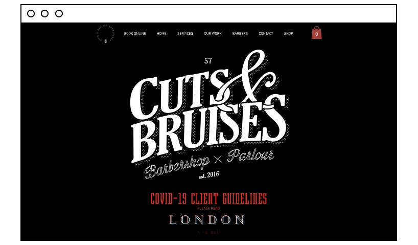
Cuts and Bruises Barbershop is a fantastic example of a barbershop that has used its web presence to boost its business effectively. The site is simple, intuitive, and easy to get around. It uses nice visuals to draw the visitor in and uses professional video integration to give visitors a real insight into how a visit might unfold if they were to book an appointment in the salon. They also cleverly integrated their social feed, giving potential clients an even more detailed impression of what to expect in the salon.
7) MDG Salons
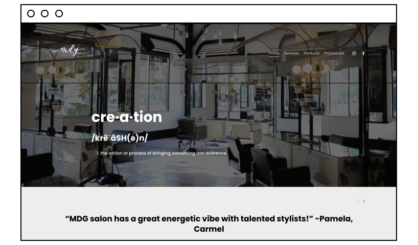
Most people book a beauty appointment either because they want to change their look or because they want to relax. What MDG does very well via its site is to create an impression of indulgent pampering, a luxury that makes it extremely appealing for those looking for a bit of R&R. On the site, visitors can look at the wide range of beauty services available to try. They did this by adding an eye-catching slider with images of beautiful models. The site also keeps things minimal to create a clean and visually appealing look. They also made use of testimonials to help convert customers and urge them to make a booking.
8) DBK Salon
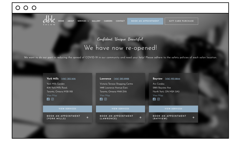
DBK salon is another fine example of how to do a beauty salon website right. The stunning design features of this site are what makes it really stand out, with clear typography and bold, crisp images. DBK Salon also uses a grayscale scheme to make it unique and striking and promote aesthetic appeal. It keeps words to a minimum but chooses them carefully to ensure it delivers the most significant impact. For example, the tagline, “Confident. Unique. Beautiful” speaks volumes and will resonate with a broad audience.
Its booking CTAs are also straightforward, and the booking procedure also has the added benefit of allowing customers to specify their preferred beautician. Guest reviews are also visible to site visitors, which boosts business credibility. Linked to the site is its Instagram feed, where customers can view even more incredible images to help keep them interested.
9) Salon 29
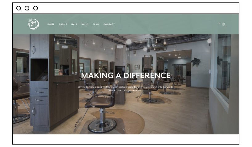
Salon 29 works so well because it exudes subtle sophistication. It doesn’t go for an all-singing, all-dancing effect, and it doesn’t try to wow visitors with special effects. Yet, it pulls off understated elegance and a cool vibe by adding a bold logo, using a crisp, large image, and showcasing plenty of testimonials from satisfied customers. The integrated social media accounts are an added bonus encouraging visitors to interact. If you prefer a minimalist approach that’s super effective, Salon 29 certainly shows us how to keep things clear, smart, and stylish.
10) Altitude Salon
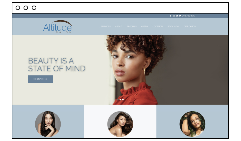
Choosing your color scheme can be one of the most challenging decisions when building a website. Get them right, and it will boost brand recognition and draw attention to essential elements. Altitude Salon does this effectively by combining cool, muted shades with attractive imagery to keep visitors on the site. The homepage is simple with an easy to navigate menu. The images and content work harmoniously together to demonstrate how the salon helps make customers feel beautiful, strong, and empowered. This very effective messaging makes it hard not to book an appointment.
11) Lisa Dinh Hair Studio
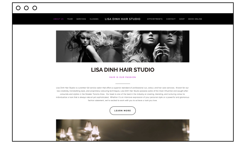
What the Lisa Dinh Hair Studio does noticeably well is provide warmth and reveal the human face behind the brand. When you visit a hair salon, feeling relaxed and comfortable is so important. This site welcomes visitors warmly and allows them to view behind-the-scenes videos, staff profiles, and links to staff social profiles too. This does two things: first, it gives an impression of friendliness and honesty. It isn’t trying to hide anything – the opposite, in fact. Second, it evokes a sense of pride. The business obviously values and takes care of the people working there, which is very attractive to potential customers.
12) Bleach London
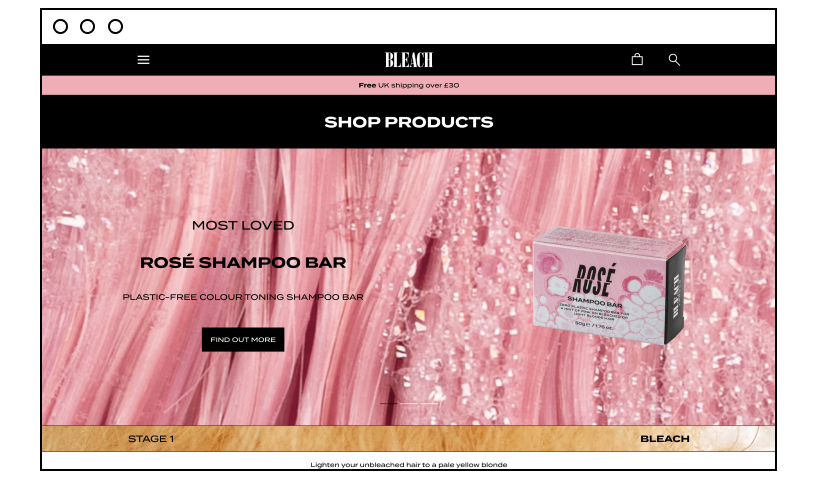
Bleach London is a fantastic example of a site that’s young, fresh, and full of energy. It does things differently by keeping the site bold, bright, and fun. On the site, visitors can stay connected to the business via their social media channels, book appointments, and buy products. Bleach London has cleverly integrated its Instagram gallery onto its site so visitors can view both their uploaded content and user-generated content where clients have added the #bleachlondon hashtag to its pictures.
Create a stunning beauty salon website today!
Hopefully, the above examples will inspire those looking to set up an innovative, attractive, and effective website for their beauty businesses. You can see there are so many different ways to make your site both visually appealing and functional. A great website will make you more visible in search engines, will help visitors keep in touch with your business, will reinforce your branding, and persuade visitors to book appointments with you over your competitors. So, investing the time to build a robust online presence is something all beauty business owners should be willing to do.

