
If we look back in time, we can see how our world has changed. Artificial intelligence, social media, cloud computing — our lives have become “smart” and digitized. As a result, the pace of our lives has accelerated, and we want to have access to information easily and fast. So it isn’t surprising that the number of smartphone users in the world today is 3.8 billion (or 48.20% of the world population.)
As a website owner, you need to use these statistics for your benefit. Therefore, providing an enhanced mobile experience must be an essential point in your plan. This way, you will retain your loyal audience and attract new visitors.
How can you build a responsive website and earn users’ appreciation? Read further and learn what responsive design means, how you can make web pages responsive, and how to solve responsiveness issues.
![Build your website today! [Get started]](https://blog.boxmode.com/wp-content/uploads/2021/09/CTA-2_1-3.png)
What Is Responsive Design?
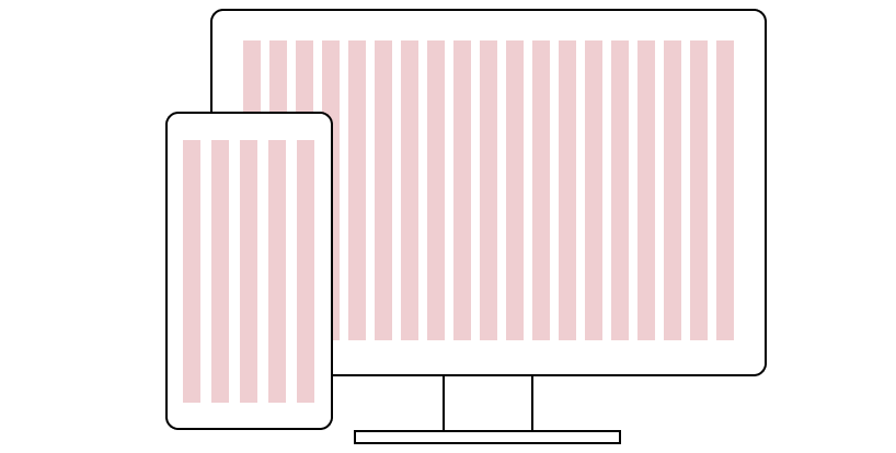
Simply put, responsive web design means that a website works well on mobile, tablet, and desktop devices. When a user opens a website on one of these devices, layout and content automatically respond to its parameters and display correctly. A user doesn’t need to enlarge, zoom, or shrink a website to see its content and navigate between the pages.
Technically, responsive design is a graphic user interface approach used to establish a connection between a user’s behavior and a website based on screen size. For this purpose, designers use flexible grids, images, and CSS media queries (CSS features that enable web page content to adapt to different screen sizes and resolutions). The specialists size elements in relative units (%) and in such a way ensure that the website’s design is consistent across different devices.
Why Is It Important to Have a Responsive Website?
With technological development, the variety of gadgets has increased. So now we live in a multi-screen society, where we want to have a good user experience on any device. From this perspective, it’s essential for your site to be responsive and look appealing on different screens.
Moreover, as statistics show, in July 2021, 55.77% of all web traffic came through mobile phones. It means a mobile-friendly website can help you increase your reach to your audience.

Making your website with a responsive design, you can:
- Attract a new audience. Responsive design makes it easier to view your site on devices in different shapes and sizes. So, users will gladly visit your site and spend time on it.
- Boost SEO (search engine optimization). A search engine is a great place where you can get organic traffic to your site. To increase the website’s position in search results, you need to follow the search engine’s rules and optimize your site accordingly. Depending on the search engine, there are different ranking factors. For example, Google, to improve search results for mobile users, named mobile-friendliness as a ranking factor and favors responsive websites.
- Decrease bound rate. Your potential customers expect to see a fast, user-friendly website compatible with any device. Otherwise, they close your site and go to your competitors. A responsive website loads fast, has a convenient interface and clear call-to-actions. It makes a user’s journey on your site incredible and, in such a way, helps reduce the bounce rate.
- Easy track analytics. Having one site for all devices makes it easier to keep an eye on the analytics and get valuable insights from different devices in one place.
- Make consistent design. Designing and customizing a mobile website and a traditional one can take a lot of time and effort, and you always need to check them for consistency. In turn, a responsive website allows you to have the same design across all devices and easily make any changes, if necessary.
- Improve conversion rates. When users feel comfortable on a website, they are more likely to want to purchase your products or services.
3 Key Principles of Responsive Web Design
If you want to build a responsive website, you need to know these three essential web design techniques.
Fluid grids
Compared to old websites based on a newspaper layout with columns displaying in one size and position (pixels), modern responsive websites look different. Their design measures in percentages and can change according to the screen resolution. Fluid grids or “flexible grid” is the basis of responsive web design. You can adjust text size, widths, and margins in percentages, and your site will accommodate the display space.
Media queries
Media queries (or breakpoints) are CSS rules that allow you to manage styles of the website’s elements based on what the screen can display. A responsive website detects the device (its resolution/viewpoint) and shows the content correctly. You can customize the width, height, device-height, aspect ratio, and other CSS properties and observe how your site will look on different devices by resizing it in your desktop browser.
Flexible media
What is the way to make images and other media respond and load correctly on different devices? On a responsive website, you can scale (CSS max-width property) or crop (CSS overflow property) visuals. With scaling, you set the media item’s max-width at 100%, and the browser will adapt it to the container width. If you crop the image, its portion will be hidden but still fit the container.
How to Create a Responsive Website?
Of course, if you are a professional developer or designer, you can customize your website with code and make it responsive. But how to get a responsive website if you don’t have coding skills? The simplest solution for you is to use a tool, such as a responsive website builder. It includes a toolset with necessary functionality: a drag and drop editor, pre-designed templates, customized widgets, and many more.
Using a website builder, you can create a mobile-friendly website easily and quickly on your own. Boxmode website builder makes it possible to create a responsive website that looks attractive on different screens. Using a preview option directly in the editor, you can check the appearance of your site on desktop, tablet, and mobile devices before publishing your project.
Give Boxmode a Try. It’s Free [Create Website]
How to Make an Existing Website Responsive?
If you already have a published website and want to improve its responsiveness, you need to understand how HTML and CSS work and use one of the responsive frameworks. Among the prominent ones are:
- Bootstrap. It’s a free, open-source framework directed at creating mobile-first sites and apps. You can design and customize your site using the Bootstrap HTML and CSS templates for interface components (typography, buttons, navigation, and others), Javascripts plugins, and Sass variables.
- Foundation. This responsive front-end framework offers you grid and HTML and CSS UI components, templates, and code snippets. Make your website’s design suitable for any screen resolution by defining the size of columns, fonts, colors, and so on.
- YAML. It’s a cross-browser CSS framework with modules for flexible layouts. It allows you to develop a custom CSS-based eLML (eLesson Markup Language) design for your website. Also, you can integrate eLML content elements in your CMS (content management system).
Apart from mentioned frameworks, you can always consider website building platforms. They have a wide range of features to help you build flexible, easy drag and drop websites.
Responsiveness Matters
According to the web design statistics, 73.1% of consumers leave a site with a non-responsive design, and 62% of companies increased their sales thanks to designing responsive websites. Do you need any more arguments to start creating a responsive website?
Take a look at best practices in responsive web design and mobile UX design, and build a powerful, user-friendly website with responsive design.