
With more businesses going online every day, website design has become one of the key focuses for the success of these companies. Whether you’re an ecommerce entrepreneur, blog writer, or you’re selling your services through your website, user-friendliness is essential for keeping your customers on-site. And this includes ensuring your online visitor can use your website effortlessly with a mobile device.
Statistics show that more than 90% of internet users worldwide have gone online using their mobile devices in 2020. If you’re looking for a figure, how about 4.28 billion? This is the number of unique mobile internet users! The same report estimates more than 55% of all web traffic was made up of mobile users in July 2021.
It makes great business sense to capture this audience as part of your marketing strategy, and one of the first steps to doing this is considering your mobile website design. Take advantage of our website builder, which includes customizable and responsive mobile templates. You can rest assured your website is attractive to billions of unique mobile internet users worldwide!

10 Mobile Site Examples for Inspiration and Online Success
If you need another reason for optimizing your website for mobile traffic, consider the power of Google search. Google algorithm updates are showing that mobile-friendly websites are ranking high in searches. If you haven’t done this before, it’s time to optimize your site’s online experience for mobile internet users. Use these 15 mobile site examples to get you inspired for online success.
1) Tesla Motors
Before Starting Your Web Design Business
Are you thinking of setting up your own car showroom and want to take advantage of your website to drive sales? Wow you visitors with these mobile-friendly website design tips used by Tesla Motors:
- Good usage of white space to balance all the elements used on a page without crowding an already-small screen.
- Optimal use of accent colors to draw attention where it needs to go, such as CTAs.
- Use of mobile-friendly text font and size, making it easy to read at a glance without having to zoom in on the page.
- Buttons are well-sized and easy to use on all mobile devices, minimizing the frustration level of the online user.
- Well-crafted art design and images are clear and provide a concise view of the vehicles for sale.
Tesla Motors is taking its mobile customers seriously by ensuring a smooth and professional online experience when using either an iOS or Android device. Do the same for your automotive mobile website design.
2) Gabby Bernstein
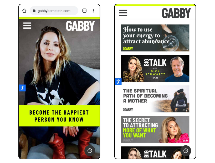
When it comes to selling services online, your website needs to look good both on desktops and mobile devices. Gabby Bernstein, a manifesting coach and author, has done this well. She offers her online visitors access by downloading a mobile app for both iOS and Android devices. And you can be sure your mobile web experience will be smooth.
The website design is clean, which works well for mobile devices, and video content is exciting and vibrant, even on smaller screens. Podcasts are a great feature, and with the tap of the screen, you can select the one you want to listen to with clear images. Buying this coach’s books from your mobile is also simple. Tap on the image of the book you want, and you’ll be directed through the purchase process.
The design is simple but effective, using limited accent colors for CTA buttons. Text font and size also fit well for all mobile devices.
3) Lean Labs
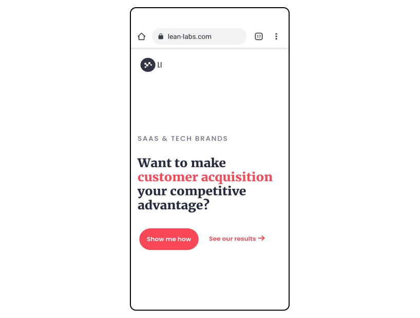
Marketing agencies are always looking for ways to be one step ahead of their competitors. Lean Labs does this by offering its mobile users an online experience they’ll never forget. Its mobile-friendly website design is responsive, interactive, and engaging while being effortlessly smooth on all phones.
Take note of how the company uses contrast to separate the elements of a page. Correct typography is used with the mobile user in mind, and smart use of images conveys the brand’s message without distracting you. Lean Labs website designers went all out using art design that flows well on any mobile device, and your attention is always drawn to their key product with emphasis placed on the CTA button. The use of icons guides the mobile user through all the steps while scrolling through the website home page.
4) Lego
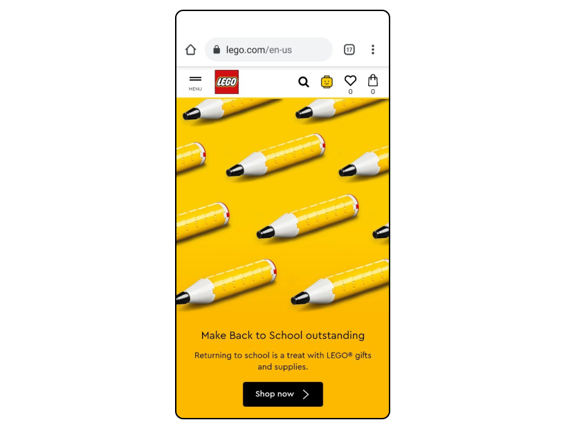
Lego’s website is a masterpiece considering the company’s appealing to a diverse audience that includes both kids and adults. Somehow, Lego has managed to show its brightly-colored and busy-looking products without being overwhelming, even for its mobile traffic. In addition, their user interface is vibrant but clean.
Scrolling is easy with a scroll bar on the right-hand side of the screen, and a drop-down menu takes you to all the different categories. A search bar at the top of the screen gives you quick access to whatever product you’re searching for. And, Lego adds some fun elements by including videos of their popular characters.
If you’re selling a similar product, then follow Lego’s example and have fun with your mobile-friendly website design.
5) Nationwide Insurance
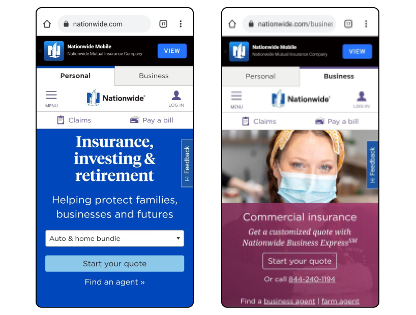
This insurance company has really made sure its mobile users find it easy to do business with them. The first two tabs you see at the top of the screen help you pick the right services immediately without having to scroll through different categories. At the bottom of the page, you have the option of finding an agent or financial advisor by clicking on either.
The use of typeface against a color background helps make the words stand out for easy reading on smaller screens. You also have the option of selecting your preferred language with a tap button, and a drop-down menu gives you other categories to search. Nationwide has made the mobile web experience smooth and simple without crowding the screen with all its features.
6) Microsoft
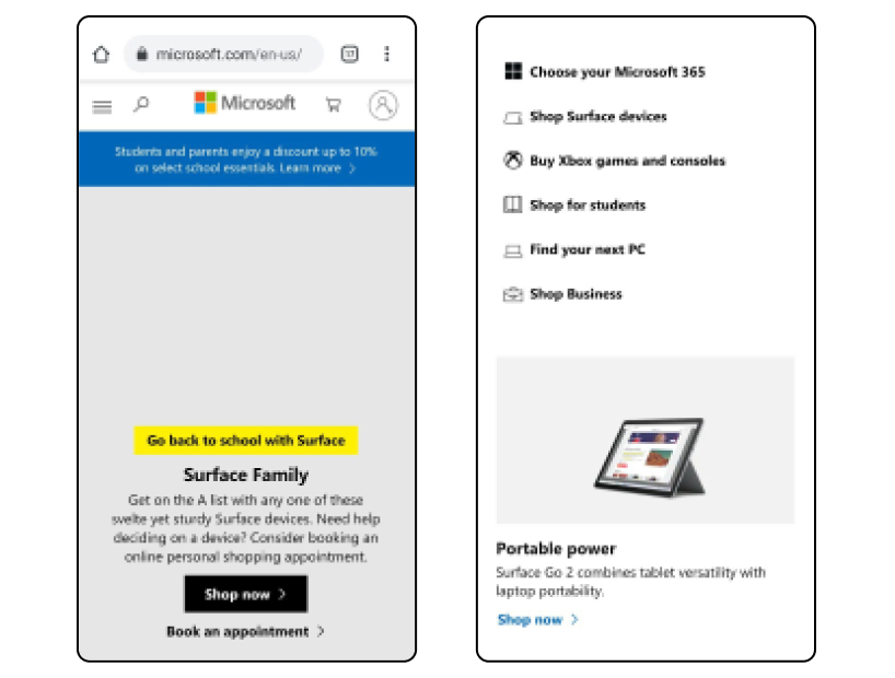
A mobile website design example from one of the biggest online platforms, Microsoft, would not go amiss here. Go to its mobile website, and you’ll notice immediately how creative they’ve been with the user interface. With an emphasis on mobile user experience, Microsoft has taken advantage of up-to-date website design trends.
These include features such as a card-style layout and flat design. Why? Because this design works excellently on the smaller screens of devices such as tablets and mobiles. Other features include:
- A search bar at the top of the screen;
- Relevant icons such as a shopping cart;
- A scroll bar for easy scrolling;
- Side arrows for swiping while searching;
- White space with accent colors for CTA buttons;
- Simple but effective use of images and text.
There’s nothing elaborate with Microsoft’s website design, but it works well and guarantees a smooth and simple web experience for mobile visitors.
7) Nike
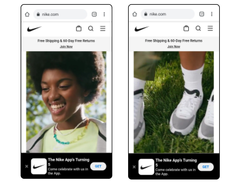
Another massive brand with a cool website that offers its customers an excellent online experience is Nike. And its design for mobile users is seriously simple while still impressive. Nike goes all out in using images to sell its products. And the company hasn’t skimped on the quality of their images either.
The use of text is limited, making it easy to keep the interface clean and straightforward. Bold text with strong font and optimal sizes for mobile screens is another crucial feature of this brand’s website design for mobile visitors. In addition, white space and clever use of accent colors for text and CTA buttons make smart contrast. It’s obvious Nike’s website designers placed a huge emphasis on a simple but impactful design.
8) Booking.com
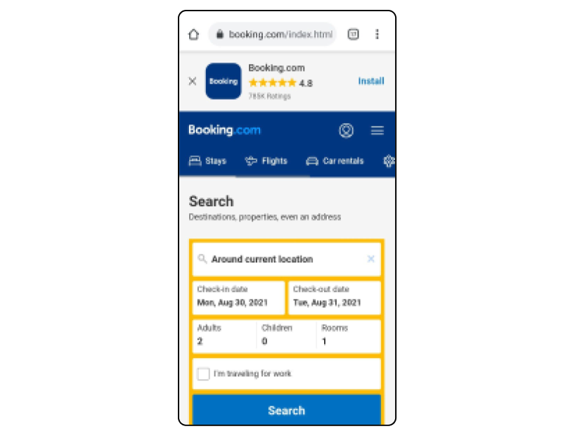
Searching for and booking accommodation on your mobile can be frustrating, and yet some companies do get their mobile design right. Booking.com is one such company that managed to include all the information you need when making a booking without overwhelming your mobile experience.
CTA buttons stand out and make it easy for visitors to book and search for accommodation. Functional mobile features are used to ensure you’re given all the details you need without overcrowding your screen or slowing down online performance. Pricing, details of accommodation types, images of rooms, as well as location are all still included, even for mobile searches. But Booking.com website designers have ensured your mobile web experience is smooth and painless.
9) Shutterfly
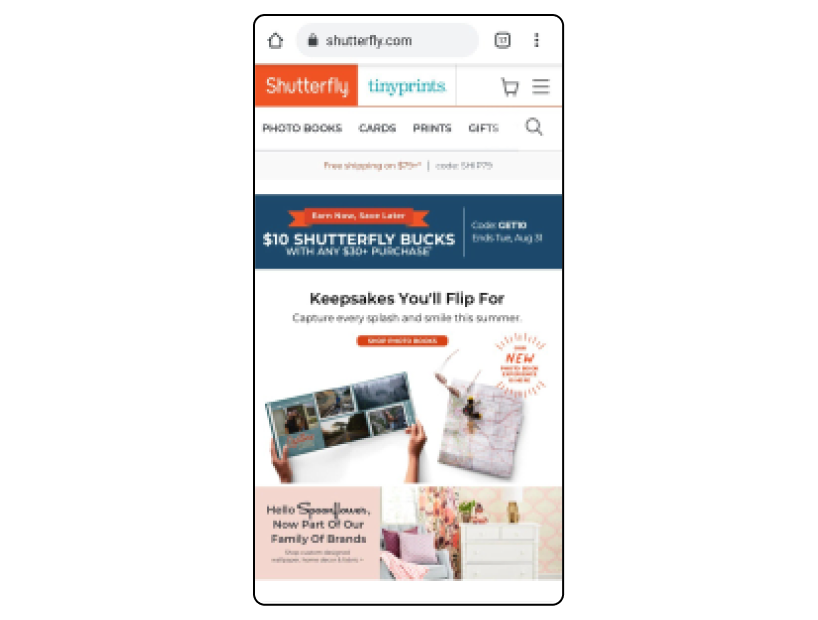
Shutterfly lets you design photo books and personalized stationery with minimal effort, and the platform has made it even easier for mobile users. Large icons, huge CTA buttons, and categories are all great features of this mobile website design.
Shutterfly isn’t shy about using big images either, and its photos are clear even on smaller mobile screens. Font and text size are bold, easy-to-read, and tell you exactly what you need to know. This mobile platform focuses on keeping the mobile web experience simple, efficient, and fun while getting creative.
10) Lyft
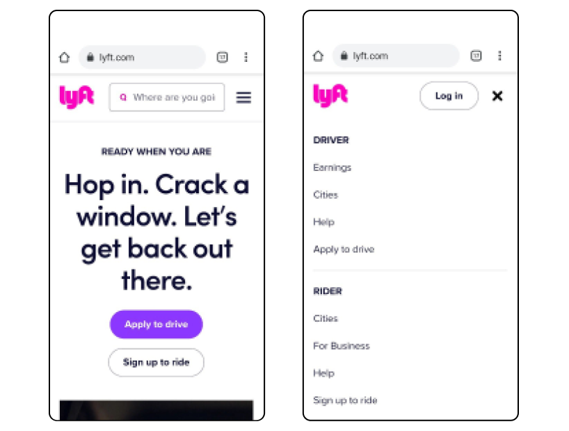
Clear backgrounds, big words with the right font for mobile screens, and bright images are all key features of the Lyft mobile website. Relevant icons take the user to the sections they need while buttons are clearly defined for riders and drivers.
Everything about Lyft’s website for mobile visitors keeps the online experience simple with its easy user interface. Contrast, white space, bold typography, and an organized menu are the stand-out features of this mobile site.
Final Thoughts
For the best mobile website design, you need to consider functionality to optimize your features on a smaller screen. By looking at these mobile website examples, you can decide which key features would work for your own online business.
A responsive website for mobile internet users often includes a simpler design than desktop browsers. But you don’t have to lose out on effect as companies such as Nike have proved with their website for mobile users.