When visitors open a website, they decide almost instantly whether or not they will browse or bounce. Before even reading the information on the page, most people notice your website’s style. Selecting font types for your website is an essential part of your web design process. Not only do fonts provide an aesthetic element, but they are also crucial for legibility and continuity of your branding.
When it comes to having a best-in-class website, it is all in the details. Your website is the platform that allows you the greatest freedom to personify your brand, present your product, develop loyalty, and in many cases, make a profit. How you lay out all of these elements will determine your success with each. Think about your website design from a new user’s perspective.
- Does it capture their attention?
- Is it professional and easy to read?
- Can they get a good feel for your brand immediately?
If you have answered no or even hesitated for a moment on the answers to these, then you have some work to do. (Don’t feel overwhelmed though – this is the time to let your creativity shine!)
While most organizations spend ample time brainstorming about their content, brand personality, color scheme, and digital trends, the area that is most often overlooked is their font style design. Though it may seem to be a minor detail, it can be pretty costly if not selected correctly.
Why Your Website’s Font Design Matters
There are many different font designs available for websites. Each design tells its own story and should complement the actual messaging it portrays.

A font style may speak even louder than the words on your pages.
A font design can evoke its own feelings and emotions separate from the content it conveys. It also depends heavily on how and where each different font type is used. For example, a clean, script font can allude to elegance, while a decorative font may feel chaotic. The opposite case can be true as well, depending on the context. A script font used for body copy can be difficult to read and feel careless, while a display or decorative font for a headline can be eye-catching and bold.
If using a website builder like Boxmode, there are a number of beautifully themed templates that include effective and attractive fonts. You may also decide to code in your own font that fits within your brand guidelines or change it up to establish your website’s personality.

Regardless of how you are creating your website, it should look perfect while accomplishing your company goals.
Before you choose a font, you must first understand the types of fonts available. While thousands of fonts are accessible on the web, they tend to fit into four main categories. Each font style has its own visual identity and set of attributes. When narrowing down the font types, it’s crucial to consider what the chosen font will say about your website and brand. Here are the four key font types you should be familiar with:
- Serif fonts,
- Sans-serif fonts,
- Display/decorative fonts, and
- Script fonts.
Serif Fonts
The serif font family contains the most traditional options available. The origin of this style dates back centuries ago. The most notable differentiator for serif fonts is the little “feet” or font strokes at the end of each letter. The serifs are most notable on letters like “T” or “K” with flat edges. (You will not see the difference on letters like “o” or “e” that are rounded).
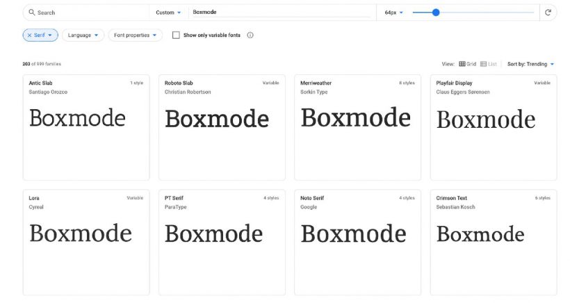
Some of the most widely used serif fonts include:
- Times New Roman
- Garamond
- Georgia
- Bookman Old Style
- Palatino
These serif fonts tend to evoke a more traditional, classic perception. They are also a bit more basic than other options out there.
Sans-Serif Fonts
A sans-serif font type literally is “sans” (without) the serifs or additional markings at the end of each letter. The general feeling had been that sans serif fonts were the most legible for the web while serif fonts were best for print. More recent findings have shown that the serifs are less pertinent than the actual cohesiveness and legibility of how they are used.
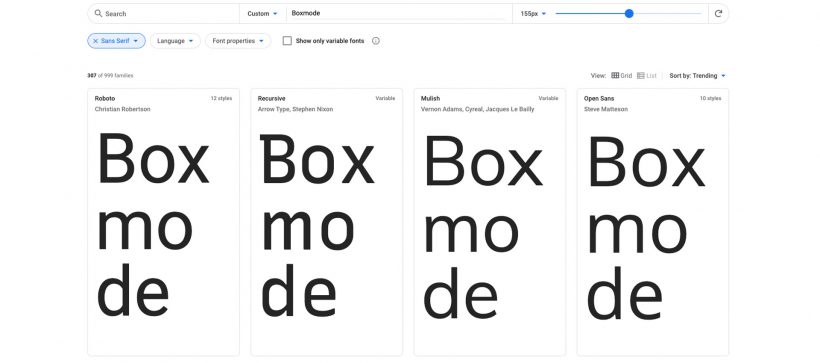
The most popular sans-serif fonts include:
- Calibri
- Gill Sans
- Arial
- Helvetica
- Avenir
The sans-serif font type is widely used for body copy and copy that is smaller and/or closer together on web pages. This font design style generally portrays a more clean and modern perception.
Display/Decorative Fonts
Decorative or display fonts are the most distinct ones available. Each one is more diverse and dramatic than the next, making it even more important to select one that fits within your branding.
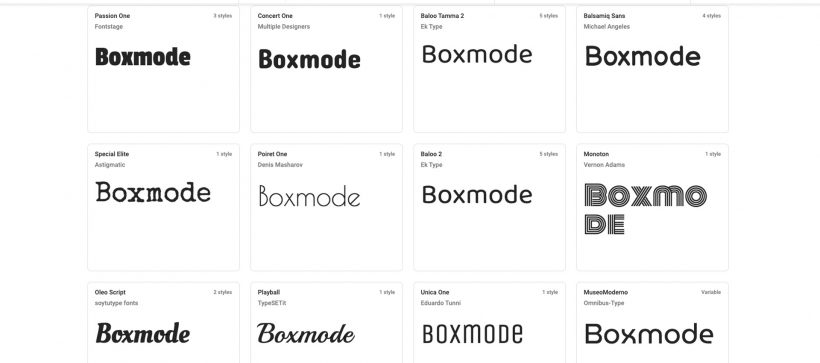
Some examples of display/decorative fonts include:
- Time-period fonts like Papyrus
- Handwritten or calligraphy fonts like Bradley Hand
- Elaborate fonts like PHOSPHATE
These fonts should really only be used in a large size for a small amount of copy. Less is definitely more. They are best used for headlines with a few creatively implemented exceptions. Display fonts are more juvenile, friendly, and trendy. They tend to feel much more unique and can even be viewed as an extension of the brand they describe.
Script Fonts
Script fonts tend to be more formal, although modernized script typography has emerged in recent years. It is virtually a digitized version of the traditional script you were taught in school.
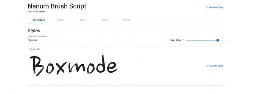
A few examples of script fonts include:
- Nanum Brush Script
- Savoye
- Edwardian Script
Script fonts allude to a more luxurious or opulent feel. However, they should also be used sparingly and methodically as they can be difficult to read in large blocks or smaller font types.
Mixing Fonts
Mixing fonts is not a faux pas. In fact, if done right, it can be a huge hit amongst your visitors. Depending on your typography needs, you can combine fonts from each to create attractive and successful pages. Just make sure they fit together cohesively and do not clash.
Once you narrow down which font design you will use, don’t forget to decide on the color as well. Color is equally key. The better color contrast you have from the background, the better readability your website will have.
How to Choose the Best Font Design For Website
1. Include fonts in your branding guidelines.
Font designs should be a central part of your brand’s personality (and not an afterthought). When doing brainstorms or vision boards, include a few options for font types and colors as part of your concept. Do your research to find an array of possibilities. You’ll want to ensure they align with your style and overall messaging.
2. Consider how many font types you will use.
Once you’ve crafted a design guide for your brand, think about how many fonts you will use. Three is usually the magic number, as you will want one distinct font type for your headings, one for your subheadings and one for your body copy. The more fonts you have on your site, the more visually distracting it will be. If you want to differentiate or call out certain portions of text, consider playing with the font sizing or colors rather than the font design itself.
3. Select your favorites and test them.
We cannot stress enough the importance of testing all design features implemented on your website before setting them live and walking away. This holds especially true for fonts. Test the fonts to understand exactly how they will look when your customer views your website. Examine your website closely on various devices like a desktop, laptop, tablet, and smartphone and on multiple web browsers.
There are quite a few time-saving tools that can show you how your website appears across multiple channels all in one platform. A few examples of these are BrowserStack, Comparium, and LambdaTest. If a font style does not render the way you intended it to in a popular browser, you will probably want to select a different one.
Using testing software is a great way to narrow down the options. At the most basic level, it can help you understand if one font is superior to another. In addition, doing an internal, or, better yet, an external focus group can also give great insight into the effectiveness of your website’s overall design. You want the website to be as impactful as possible for your current and future consumers. What better way to understand how it is viewed than by asking your customers directly?
4. Keep it consistent.
Regardless of which font style design you select, keep it consistent. If you choose a particular font design for the headlines on one page, carry it evenly throughout all inner pages. Switching between fonts can make the information overwhelming to the viewers. You don’t want to distract them from your website’s main objective. Also, be mindful of your font size. According to Creative Market, the most optimal font size for a website is 10 and above. This ensures your font can be read easily and quickly.
Selecting the right font style design for your website should be a central part of your website design plan. It should also be fun! Before you begin, educate yourself on the various types of serif, sans-serif, display/decorative, and script fonts, and what they will say on their own about your brand. Start the process by envisioning possible font contenders as part of the overall design story for your organization. Consider how many you would like to implement and where they would be used. Then, select your favorites and see them through customers’ eyes on various platforms.

