Website footers aren’t important. You always believed it. Come on, everyone knows there’s nothing interesting to find at the footer except for “All rights reserved” and navigation. You think, this time, it will be the same. You scroll down lazily, and suddenly, at the very bottom of the page, you find something so beautifully designed that it makes your jaw drop. You react, “Wow, wait, they worked here to make it a special place for me… They were thinking about me in every minor detail. I’d better stay.” This is a creative website footer, baby.
And here is our collection of the most breathtaking website footer examples inspiring us to reconsider our web designs to keep them creative and user-focused till the end.
But before we move on to our heroes, what’s a website footer anyway, and what’s so cool in it?
What is a footer on a website?
A website basically has three major parts. A header greets a user at the very top. Then, it steps up your star content, and then, at the very bottom, goes a footer, your final frontier, where you place the information that completes the experience. Many businesses neglect this part of a website turning it into some sort of a dump for content that doesn’t fit anywhere else (like copyright, sitemap, and social media buttons).
Here are some website footer features that are too important to be discarded as a formality.
It helps frame the overall design.
Unlike middle website content that shifts on every page, a footer remains consistent throughout the entire website. By having a random footer design, you miss an opportunity to create a coherent impression. If elaborated purposefully, website footer design helps unify all other web design elements into one holistic, beautiful, and meaningful experience. It underlines all your design efforts.
It helps to have all key information at hand when making a decision.
People scroll down very quickly. The good news is that they will definitely reach your footer. The bad news is that users hate scrolling all the way up to find the necessary information to make a decision. So if your footer fails to provide it, your conversion rates will suffer. The footer is a perfect place to remind your users of core details (terms of use, contacts, your awards, partners, etc.) and give a little nudge with a call-to-action.
It amazes where it’s least expected.
A footer is where creative brands thrive. It’s your web real estate where you can legally go wild with your brand personality using striking images, animation, music, and even jokes about stimulating your visitor’s emotions. The examples of cool footers we will show below prove you’re free to fulfill your craziest website footer ideas, as long as you keep it professional and organized.
What should be in the footer of a website?
Great footer design is not only about the visual effect but also about functionality. And there is always a delicate balance between these two. To design a really cool footer, you need to take the best practices and then get some brand personality meat on these bones.
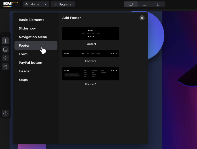
The fantastic thing to know is that Boxmode has already taken care of the hard part. We added a new cool footer widget to our website builder. The easy part left for you is to have fun and customize it according to your brand style. (With Boxmode, you can leverage the website footer feature embedded in its themed templates. Or get even more creative, take inspiration from our footer ideas, and build your website from a “blank canvas” using a footer widget.)
So what goes in a footer?
Website footer essentials
- Copyright, Privacy Policy, and Terms of Use.
- Contact. Provide as many channels as possible to help your visitors reach out to you right away. Make sure your website footer design includes your phone number (optionally with a CTA), email, physical address (helps boost trust), and social media icons.
- Sitemap. Apart from certain SEO benefits, intuitive navigation at the website footer helps create a positive user experience. Avoid adding too many links and cluttering your footer, though.
- CTA. When the user reaches the bottom line, it’s crucial to lead them further. The key is to envision the user’s next steps and guide them with a relevant CTA.
- Personality. Show the human face of your business both literally (posting your team’s photos) and through emotional taglines, videos, events, awards, animation, logo, or everything you want your brand to be associated with. Think of a website footer as your final opportunity to relate emotionally and form the desired brand impression.
- A little SEO. Using some keywords in a website footer to help your search engine optimization is good unless you overdo it.
Website footer examples
We created this collection to celebrate the best website footers and the creativity that brought them online.
1) Blue Stag
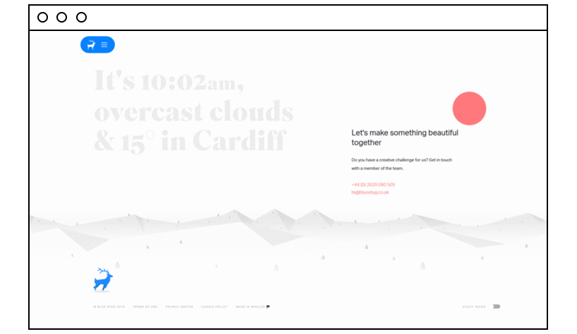
Blue Stag design studio knows a thing or two about creativity, for sure. “A running logo” (the company animated its graceful brand symbol), the emotional CTA, and the day/night modes of the page (and hence the footer) create a truly memorable impression.
2) TUX
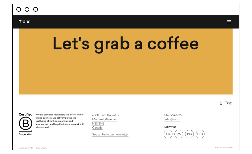
Unboring, the word that best characterizes this website. Its daring rhetoric continues in a juicy orange footer featuring the brand’s promise, contacts, social media, and…an invitation no one can resist.
3) Awwwards
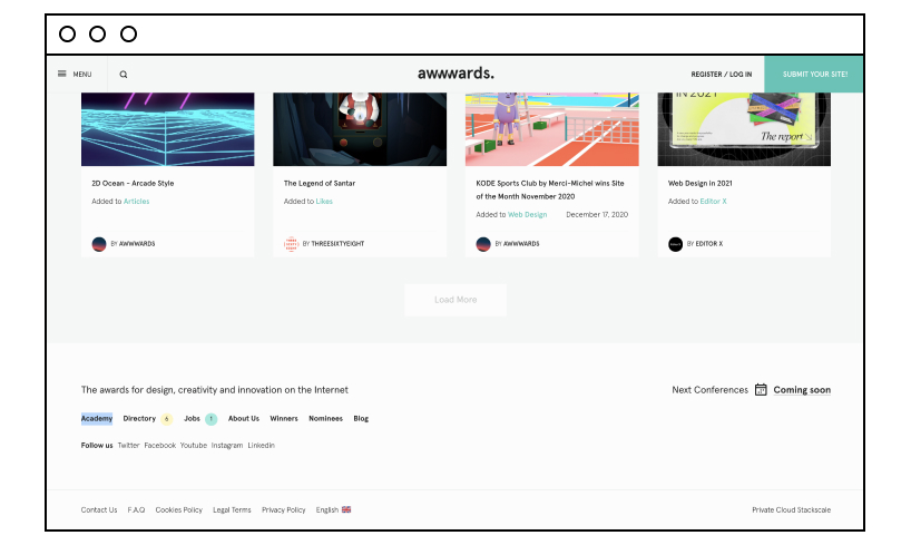
The genius of simplicity, Awwwards puts in its footer only what’s important. And look how gracefully the company combined a tagline, events, navigation, social media channels, and other formalities in this simple footer design.
4) Shantell Martin
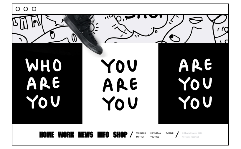
This creative website footer example is what an artist’s website must look like — one word: unusual. A monochromatic footer blends with the overall web design so well that you can’t say where exactly the footer starts.
5) -99 design studio
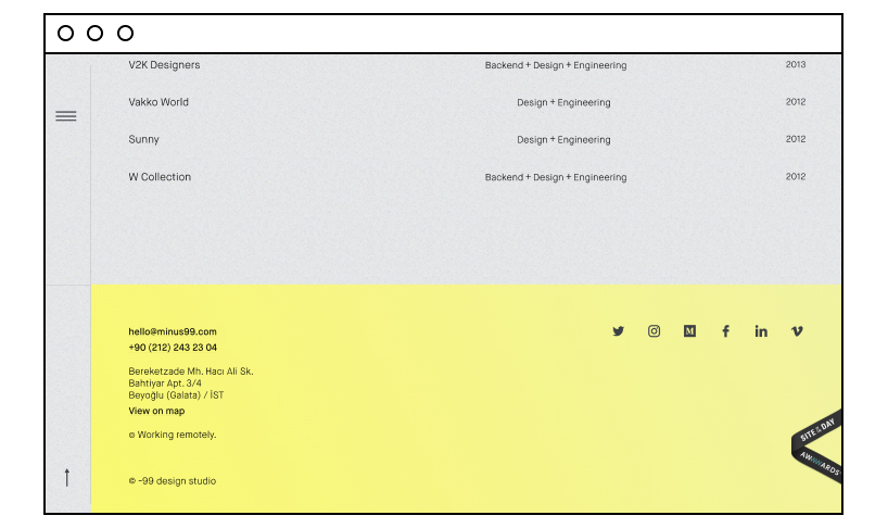
Clean and breathing website footer design that changes its color from tiffany green to yellow.
6) Stink Studios
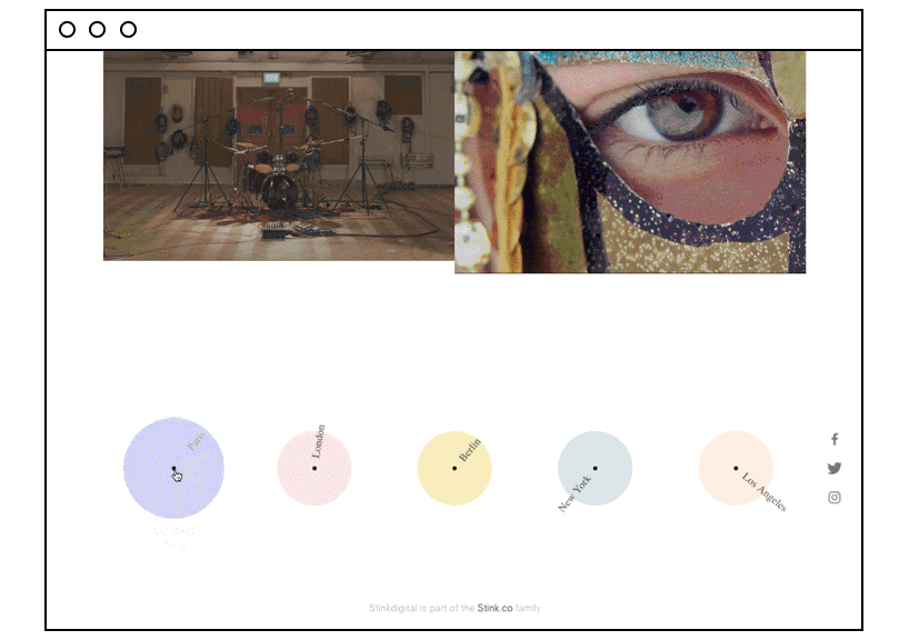
Stink Studio’s animated footer shows the local time in different parts of the world where this advertising and digital experience studio has its offices. And…a few social icons.
7) Mecannical
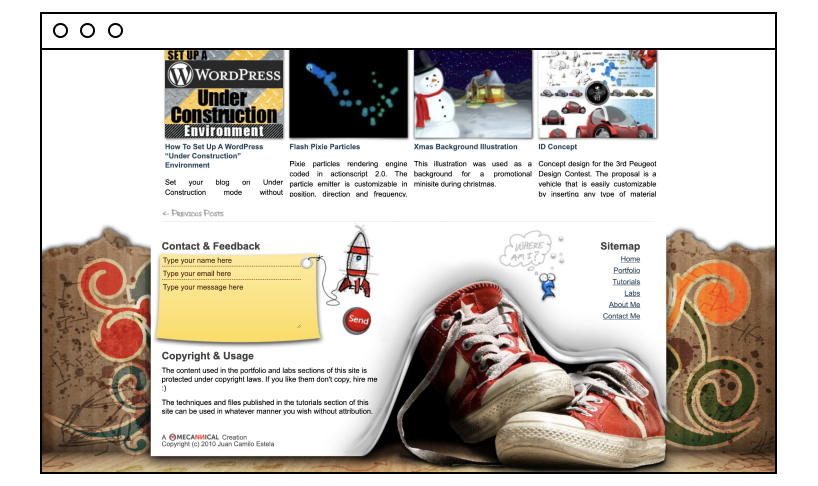
Apart from standard copyright, sitemap, and absolutely non-standard graphics, this portfolio website footer also contains a contact form to facilitate users’ feedback or (who knows) job offers.
8) Branded 7
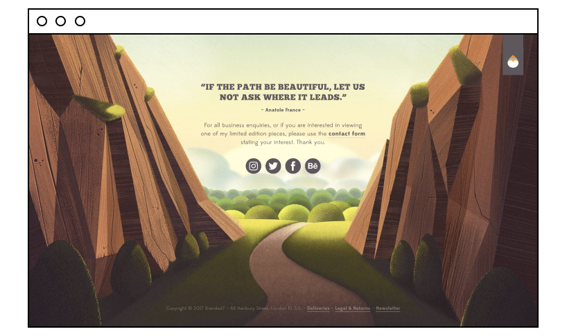
Predictably, artists create breathtakingly beautiful websites with stunning footers. But the takeaway from this footer example is not the art itself, but how using a relevant quote and warm words help create atmosphere.
9) Spinx Digital
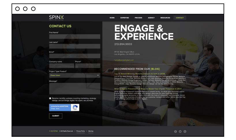
This web design company approaches a footer functionally. Every square inch of website real estate must bring value to the client. The footer is no exception. So why not include some blog recommendations and a detailed contact form to facilitate getting in touch?
10) Nerdery
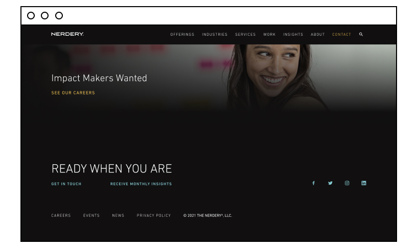
Nerdery’s home page is overly terse, and so is its footer. Despite minimalism, this footer tells and offers more than other wordier footer examples. Its simplicity fascinates.
Some Final Observations
From fancy and detailed to minimalistic and bold, footers reflect the core of a business and serve a user’s experience. With so many creative footer ideas (you can find even more online if you want), your website footer design won’t be boring anymore.